Italic calligraphy (and italic writing in general)
Lean, assured and always dynamically stylish, italic calligraphy looks like a model alphabet wearing a Milanese suit. Not surprising, given that the name 'italic' refers to the origins of the script in Italy.
Today, hand-written italic alphabets remain ever-popular for quotations, wedding invitations, art calligraphy and improving handwriting style.
This page offers you general practical information about how to write and recognise italic letters. You may also be interested in the more specific italic lettering page for detailed guidance on how to form individual italic letters, practice exercises etc.
If you look at the above illustration, you will see that an italic calligraphy alphabet shows:
- a distinctive ‘lozenge’ shape to the body of letters a, b, d, g etc
- elegant, narrow branching strokes forming the shoulders of letters such as b, h, m, n, p etc
- quite long ascenders and descenders
- usually a slight slant to the right, about 5 degrees
- a cursive, running quality and an upwards ‘flick’ at the finish of many letters
- a contrast between heavier pressure on the downstrokes and much lighter pressure on the upstrokes
- some characteristic letter forms: for example, a and g are plain and open; ascenders often have a slight flourish
You will also find when you look around that ‘italic calligraphy’ can in fact refer to many, rather differing calligraphy alphabets. ‘Italic’ is the name of a family of scripts, not just one exact form.
But all italic alphabets will show four or more of the above characteristics, and especially the first four.
Usually, italic calligraphy is written about 5 nib-widths high. This means the height of an italic letter is a little greater in proportion to the nib-width than many other calligraphic letterforms.

So you may wish to change to a narrower nib if you’ve previously been writing gothic, roundhand or uncial – or else, if you want to keep on with the same nib, rule a page of wider guidelines to write on.
Keep your pen angle at 45 degrees. This is important for forming the branching strokes.
You will also notice in the illustration of 'a' above, and on the more specific 'italic lettering' page, that quite a few italic letter-forms involve pushing the pen nib to the left a little, or upwards from the baseline.
Now, you may be thinking, "Wait – did she say pushing the pen? But I thought we were supposed to lead the nib across the page and never push it!"
Yes, that is the rule. It is the general rule, in order to learn how to handle a square-ended nib for writing well-formed calligraphy scripts. Once your hand has learnt that general rule and you can use it instinctively, you can start to bend it. Italic calligraphy is more cursive than other forms of calligraphy and to write it fluently does occasionally require pushing the pen, carefully.
(Of course it is possible to write a slower italic by forming the letters in separate sections without pushing the pen. Keep a careful eye on the 'counter' or white space inside the letters if you do this so it doesn’t become lumpy or too angular.)
Some more basic principles for writing good italic calligraphy:
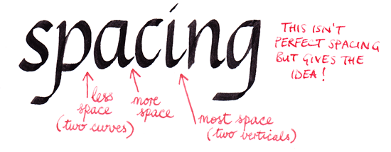
You can alter the appearance of your italic calligraphy simply by altering the amount of white space you leave between letters in a word, even if the letters are the same size:

Spacing is always important but in italic calligraphy especially so. The subtle, regular forms of italic letters are sensitive to irregular spacing and proportions. (Don’t imagine that the examples you see on these pages are always perfect examples of how to space!)
Good spacing is not just about having the same amount of space between letters. If you draw each letter in an imaginary box of the same size, you will find that the words look uneven and distorted. Because italic calligraphy is a mixture of straight and curved lines, the rules for spacing have to do with the relationships between the curves and the straights:

As you can see, letter spacing controls the white space in between letters. Separately from that, the actual width of italic letters in relation to their height is another important consideration. This is about the shape and size of the 'counter' or white space inside any letterform:

Personally, I find that to write a pleasing italic alphabet requires more practice and warming-up exercises than gothic and roundhand. Possibly others would disagree and say that all scripts require a warm-up first. That's a good routine to get into. But italics more than gothic or uncials do demand confident, rapid formation of the letters with the whole hand.
So don’t criticise your own italic calligraphy too harshly if you don’t like it straight off. As in fashion, cooking or DIY, it takes a little work behind the scenes to bring off simplicity and elegance at speed.
Practice exercises include writing rows of ms and ns ('arcades') and many 'a's and 'o's, trying to get them the same each time.

(These will come up again in the italic lettering pages!)
Your hand, arm, shoulder and eyes need to feel relaxed, focused and coordinated.
Try to build up a rhythm with the downstrokes. Concentrate on moving your whole hand while forming letters, not just your fingers.

There are more tips and illustrations for writing specific letters, and for analysing your italics, on the next page.
When your hand has thoroughly learned the 'feel' of the letters, you can more confidently produce the easy-looking, fluid strokes which distinguish italic calligraphy from any other calligraphic style.
Go on to 'Italic Lettering'
Return from 'Italic Calligraphy' to the Calligraphy Skills homepage