The Roman alphabet (for calligraphers)
The Roman alphabet, also called the Latin alphabet, is the most widely used alphabet in the world. You’re reading it right now.
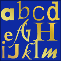
The Roman alphabet has two different forms of each letter: the minuscule or lower-case form ...
a b c d e f g h i j k l m n o p q r s t u v w x y z
and also the majuscule or upper-case form ...
A B C D E F G H I J K L M N O P Q R S T U V W X Y Z
Some other alphabets, such as Greek and Cyrillic, also have minuscule and majuscule forms. Compare Arabic, which has up to three different forms for each letter depending on how it joins with other letters; and Hebrew, which does not employ different majuscule forms but enlarges some letters for emphasis.
The Roman alphabet is also the basic alphabet used to write Western calligraphy in many languages. So it is quite important :-)
Roman letters reach all round the globe

Who uses this particular alphabet to write their mother-tongue? Most of Europe, including the UK; Turkey; America, Canada, Australia, much of Africa (including South Africa) and New Zealand, among other places.
The Roman alphabet is also used to write pinyin, which is a phonetic version of Mandarin Chinese used in teaching children and foreigners how to pronounce the sounds of written characters.
This means the Roman alphabet is being written and read by billions of people around the world every single minute.
Important non-Roman alphabets
So, who doesn’t use it? Some of the other most widely used alphabets include the Arabic, Greek, Cyrillic, Hindi and Urdu letter systems.
What about written Mandarin (and Cantonese)? Well ... actually those are not alphabets at all. They use a different kind of writing system entirely. Chinese writing uses a unique symbol for each concept. By contrast, an alphabet is a list of re-combinable symbols each of which stands for a sound.
Variations on the Roman theme
Of course not all languages written in the Roman alphabet use exactly the same sounds. (Anyone who has studied French or Spanish as a second language will be very aware of this fact!) So, many languages add special characters or marks to create their versions of Roman letters as symbols for their unique sounds. For example, French adds accents to some vowels: 'é' means to pronounce 'e' as in 'eh?' but 'è' means to pronounce it as in 'pen'. In Turkish, 'i' is pronounced as in 'pink' but the same 'i' without a dot is pronounced like the 'a' in 'maroon'.
And so on: there are dozens of adapted Roman letters, and they are not usually mentioned in calligraphy.
So, if you want to write calligraphy in French or Turkish, or for that matter in Norwegian, Polish, or Lithuanian, you have to think about how to write and space the special characters and marks.
One way of dealing with the problem is to keep a smaller nib to write 'extra' elements such as circles, dots and tails.
Brief calligrapher’s history of the Roman alphabet
It’s called the Roman alphabet for the good reason that the ancient Romans used it, or a slightly shorter version of it.
(By the way, if you're writing dates or other numbers, here is a list of Roman numerals to help you translate those 'mmx's into '2010's.)
The Romans got their alphabet ultimately from the Greeks, who got it from the Phoenicians, who got it from ... well ... a whole mixture of people in the Middle East.
And the Romans spread it all over their empire, which is how it first came to Britain; and so, later, to the Americas, Australia, etc.
The classical Roman alphabet contained only 23 letters (no J, U or W.) In the beginning, all these letters were capitals (majuscules). There were no lower-case letters (minuscules). Also, there was no word separation.

A quick glance at monumental capitals
Today, much of what we commonly know as 'Roman writing' is large capital letters inscribed on stone – typically, on monuments. These 'monumental capitals', as they are called, are wonderfully aloof, smooth and formal. They always seem grand even though they are very open and legible.
For calligraphers, the most famous example of monumental capitals is the inscription on Trajan’s column. This huge sculpted pillar was erected in Rome to mark the achievements of the emperor Trajan (AD 98-117).
The shapes and proportions of the lettering on the Trajan column have been a model for beautiful majuscules ever since. The Roman alphabet below is typed in a font called Trajan, based on the letters of the original inscription. (I got it free from Fonts 101.)

Monumental capitals are difficult to duplicate using a calligraphy pen.
Probably, the original lettering was painted onto the stone very precisely using a square-edged brush, then carefully chiselled out by the stonecutter, and then re-painted inside the cut surfaces to make the letters stand out more.
Use of monumental capitals in books
The same majestic Roman capitals are often found drawn or painted onto book-pages, for important headings. They were used right through the Middle Ages and became very popular during the Renaissance.
Monumental capitals are still often used today for titles and illuminated letters. And, of course, they form our everyday alphabet of capital letters!
But in their monumental form, they were frankly just too fiddly to write for long with a pen. Although a couple of manuscripts of Virgil survive which were written entirely in monumental capitals, this particular alphabet never became popular as a form of calligraphy for writing whole books. Other versions of the Roman alphabet were used instead.
Roman handwriting
What other kinds of Roman alphabet were there? There was Roman cursive, a scratchy, often barely legible system of writing capital letters by hand. It was used by secretaries, businessmen, and even emperors to hand-write commands.
Later in the period, a new Roman alphabet evolved. It was still very scruffy but many of the letter-forms had simplified. Letters such as 'B' had changed into something which looked more like 'b'. 'D' was becoming 'd', and so on. In other words the original capitals were turning into the minuscules or 'small letters' which we use today.
A neater version of that minuscule script developed into Roman half-uncial. (Half-uncial was hugely influential in the Middle Ages.)
But all this cursive stuff was merely for scribbling lists and scratching taxes. What about proper calligraphy?
A calligraphic Roman alphabet
Right back in the first century AD, Roman writers had invented a very handsome, energetic calligraphic script for 'smart casual' use. It was based on monumental capitals – but it was much easier to write. This Roman alphabet was used for the equivalent of posters on walls, written public announcements, etc.

It could also be written quite rapidly on paper using a square-ended pen. Quite a lot of fine manuscripts have survived written entirely in this excellent script. It was the main book alphabet of the Roman Empire during the first few centuries AD, used to write all sorts of texts in pre-Christian Latin.
‘Rustic’ capitals
It is true that this new form of the written Roman alphabet was not as elegant and spacious as the monumental capitals which adorned the public buildings of the city of Rome. And that may be why the letters were dubbed ‘rustica’ (‘rough and simple’). We now call them Roman rustic capitals.

A useful addition to any calligrapher’s sample-sheet
Despite the name, I think calligraphers should pay more attention to Roman rustic capitals. They have a strong classical aspect – the 'feel' of an ancient Roman alphabet – but with the added advantages of a dynamic rhythm and plenty of impact.
The letter-forms are quite free. The variation in height above and below the lines gives the writing rhythm and interest. (Some 'ripple' is useful if you want to create more visual movement in a piece of calligraphy.)
In short, rustic capitals are not smooth and urbane, like an imperial advisor hiding a secret behind a bland expression. (Which is how monumental capitals can look.) Instead, they are bold, overt, vigorous and compact, like the honest farmer-turned-general in the film Gladiator.
Well, that’s one way of seeing it!
Here’s what rustic capitals look like as a calligraphy alphabet:
Visit the Roman writing page for precise instructions on how to write this Roman alphabet.
There, you will also pick up a couple of astonishing Roman calligraphy-pen tricks. I don’t think you’ll find them in many other calligraphy tutorials online.
Go to the Roman writing tutorial page (rustic capitals)
Return from 'The Roman alphabet' to the Calligraphy Skills homepage
