More gothic writing: CAPITAL gothic letters A-Z
The CAPITAL gothic writing tutorial below is presented from A-Z – assuming you already know how to manipulate a calligraphy pen for lower-case gothic letters. If not, you may want to try out some of the other Gothic pages first ...
Helpfully, the following particular gothic alphabet contains many similar forms, so once you've learned one letter, chances are you'll find others easier.
Useful info about gothic majuscules
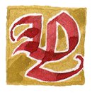
There are many, many varieties of majuscules (capital letters) used in gothic writing. So keep your eyes open for more examples of capital gothic letters A-Z or even single letters (fonts, signs, titles, manuscript facsimiles etc). Build up a collection. Once you know the basics of how to write calligraphy, you can then imitate or adapt whatever you fancy for a particular project.
Generally, gothic capitals defy the oblong up-and-down aspect of their minuscule brethren. They occupy a square area, or even a widish rectangle, and are often very rounded.
I believe this contrast came about for at least two reasons. Partly, it's because gothic capitals derive somewhat from uncial letters and later versals, which are extremely round. Partly it's because capital letters in long passages of gothic writing have always served as necessary navigational aids around the page, so the more contrast they have with the angular 'fenceposts' of the ordinary text, the better.
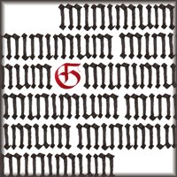
The latter fact should also tell you that gothic majuscules work very well in bright colour: traditionally, vermilion, blue or green. Important initials can have little gold boxes painted round them, as well as much other ornament. Gothic writing in general lends itself enthusiastically to majuscule decorated letters so I hope you'll have fun with those.
However, the big round shapes of the majuscules in gothic writing leave big white spaces inside (this space in any letter is called the 'counter'). And in gothic writing you must at all costs fill white space! So decorative lines, lozenges and little twiddle-twaddles abound, both inside and out.
Okay, let's get on with the actual gothic writing, rather than me twiddle-twaddling endlessly about my pet topics.
Gothic writing: majuscule gothic letters A-Z
This alphabet is written around six nib-widths high. I've laid out the letters stroke by stroke, with the newest stroke shown in red each time. Thin vertical lines are formed by turning the pen round to point directly to the left and then drawing downwards. Any other puzzling hairlines are created by twisting the pen to use just the left corner of the nib (for this, see the third gothic tutorial page).
Here's an 'Xample':

I've not put in all those bitty little 1, 2, 3 arrows to show stroke direction, as I expect by now you can see how things should go.
(Remember: the rule for gothic writing is that you always draw the nib either from higher on the page to lower, or else from the left to the right; either way, the pen moves back or sideways from where the nib is pointing. If you push the pen nib-first, then the patron demon of bad writing, Titivillus, will come spluttering out and haunt your desk. He will dry your nib, grease your page, muddy your colours and joggle your hand. Don't say I didn't warn you.)

'A', ironically, is the one letter in this alphabet which won't help you much to write any of the others. But it's simple enough. Actually, I think this 'A' is a bit sissy. I blame my exemplar. Try putting a larger, flat foot on the second downstroke, to match the first.
In fact, there are many, many forms of 'A' (and other letters) in historical gothic examples, so as a general rule don't feel too limited by what you see here.

'B' introduces a wonderful element of gothic writing which I hope you'll use again and again: the hackle. This is the 'hook' decorating the first long downstroke of the letter (fifth stroke in the sequence). It can be angular or curved; I prefer curved ... this week.
To tackle a hackle on gothic letters: as you can see, the idea is to place your nib at its usual 45-degree angle so that the right corner of the nib is just barely touching the back of the letter. From there, draw the nib across and down in a steady curl until the left corner of the nib also meets the downstroke of the letter. (Meanwhile, make sure you have kept the angle constant so that the right corner of the nib doesn't intrude over the other side of the downstroke and leave an unsightly bulge or point.)

'C' is the first of many very rounded examples in this particular catalogue of gothic writing. The basic pattern shown here is: start just below the top line; draw a smooth round 'crescent moon' from top left to bottom right – that is, thin stroke through thick stroke to thin again; go back up to the top line, just to the right of the top point of the crescent, nib at 45 degrees, and draw a vertical (add a small angle at the bottom if you like); back up, and turn the nib sideways to draw a thin line neighbouring; lastly, go to just below the top again to add the rest of the letter.
If you can do that, then you're also ready for 'E', 'G', 'O', 'Q', 'T', 'U', 'V' and 'W'. Woo-hoo!

The version of 'D' shown here is a rather splendid letter: start as for B, and then just have fun with that long ski-slope sweep of a stroke. Try not to exaggerate the curves too much. It's interesting to see from this element of gothic writing how the majuscule 'D' and the minuscule 'd' are essentially the same letter, just differing in which is the straight stroke and which is the curved.

'E' ... very much the same as 'C'. Keep the final 'tongue' fairly short. It's easy to get carried away. Ah – perhaps you are wondering about the fork on that tongue. Another twisty nib-trick: keeping the nib at 45 degrees, draw the horizontal and, while still drawing, lift the right corner of the nib off the page for the last millimetre. The right corner of the nib will leave its usual oblique line-end; the left corner of the nib, continuing, will obediently draw out the wet ink at the bottom of the stroke to form another perfectly matching point: presto! – a fork.
Did it work?
I could tell you it's just a matter of practice. But you knew that already :-)
I could also whisper that it's perfectly acceptable to go back and use a nib corner to correct the fork's edges and improve its points; all the best calligraphers do, you know.

'F' is also quite a grand letter, because its doubled black lines enclose a white stripe to create a dramatic contrast. Keep the lines smooth and slightly curved, avoiding the sharp angles of minuscule gothic writing, for a more flowing 'dazzle' effect.

'G' ... ain't this easy-peasy. Not even the forked tongue of the 'E' to worry about.
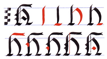
'H' is fairly self-explanatory, too, I hope. The new element is that flourished head. (Yes, it has one of those forkward awks on it, like the 'E'.)
Tip: When you draw the first downstroke, make sure you start by moving the nib slightly to the left for a tiny, initial leftwards curve into the vertical. Then you can go back to that point and draw up from it and to the right for another slight curve into the horizontal. The smooth, narrow join then introduces a more graceful forward-running flourish.
Done 'H'? Satisfied with it? Congratulations! You can now write 'Happy Birthday' in gothic writing. (Cheat: copy the example on the 'Decorated Letters' page.)

'I' is a nice, simple letter, but watch the proportions so that it doesn't end up looking too much like a 'J'. A handy rule of thumb is to make sure that the flourish at the head and the curl at the foot don't extend back further than a hackle's width plus about half again.

As you can see, a gothic 'J' is considerably more flourished than 'I'. Remember, this is quite a modern letter – in general use for only three hundred or so years. (Yes, that is modern – for gothic writing, anyway.) 'J' is therefore essentially an adaptation of 'I'; exaggerate the bowl and the top-stroke to distinguish it clearly.
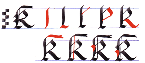
'K' is formed quite similarly to 'H'. Its chief feature is its bold diagonal leg, which should thrust forward with both assurance and decorum – ie not so inconsiderately far that the next letter in the word will be pushed away along the line.

'L' is almost as simple as 'I'. Don't overdo the curves on the horizontal. Aha, here's an interesting tidbit. That symbol coming up below is of course the '£' sign; you can see how it started off as a majuscule 'L' in gothic writing.

That 'L' stood for the Latin word 'librae', meaning 'unit of weight'. 'Librae' was the word the English used to mean 'pounds' as in 'pounds, shillings and pence' (L, s and d – librae, solidi, denarii). And why was it called a 'pound' to begin with? Scholars suggest it was because a £ consisted of enough pennies to weigh 1lb on the scales. And then 'Libra' of course also means the Balance or Scales in astrology; and gives us the words 'equilibrium' (equal balance), to 'deliberate' (weigh up, balance out in one's thoughts) and 'library' (place where the unbalanced hang out ... joke.)
Enough word histories? Seriously? Oh very well – moving on ...
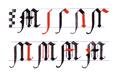
'M' is quite tall and graceful. Try not to make the shoulders too wide. Think of those high, narrow, arched windows in gothic cathedrals. (I do think there are quite a few interesting similarities between gothic architecture and gothic writing.)
Important Announcement: you are now half-way through 'Majuscule Gothic Letters A-Z'! Stop. Get up. Stretch. Shake out your writing hand and give it a bit of a massage. Contemplate the infinite, or, possibly, the chocolate supplies. (Which always, sadly, turn out to be finite.)
Mmm: 85% cocoa solids is the best. Ready? Here we go again:

'N', you will be happy to know, is nothing more complex than a hatless 'H'.

The challenge with 'O' as in any calligraphy alphabet, gothic or otherwise, is to get the curves balanced so that the overall aspect is smoothly round and upright, rather than eggy or tipsy or squished on one side.

'P', as you see, begins like a B but the stem goes below the line so you get a nice large brash bowl.

'Q', like 'D', is an opportunity for a bit of a flourish – this time, below the line.

'R' should be easy: it's more or less the top half of a 'B' stitched onto the bottom half of a 'K'. Make sure it has a rather larger bow at the top than a 'B', though. And the same warning applies about the leg as for 'K'.

'S'. Hm. In gothic writing, majuscule 'S' comes in so many varieties that I am inclined (when time permits) to give it its own page. But, for the moment, this version resembles 'F' in consisting for the most part of two parallel, slightly curving lines. Be sure to begin and end the diagonal middle section below the top-line and above the base-line, so that you have space for a graceful transition into the head and foot of the letter. The final diagonals should be positioned so that if either were extended in a straight line it would meet the other.

'T', by way of relief after 'S', is the simplest round letter of all these gothic letters A-Z. Keep the horizontal smooth, and balance its width against the curve of the body; don't let it go too far in either direction, and not too curly either.

'U', too, can draw 'U', too. (Ho, ho, ho.) Seriously: it's almost the same as the 'C's and 'G's earlier. The main difference is the little left-pointing flourish; and even that is rather like the beginning of a 'T'.

'V' is extremely similar to the other round letters, but it is useful to make the first 'crescent moon' shape a little narrower and more egg-shaped than in 'U' and its fellows, so as to help your reader to decide more readily which letter it is.
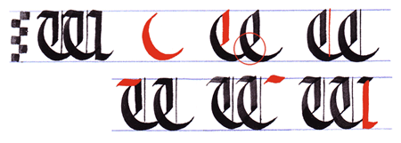
'W' is a walloping great humdinger of a letter and I have stuck it on two lines not because of its multiple stages of formation but out of respect for its considerable width.
But for all that, it is indeed nothing worse than a 'double U': it's another modern letter in gothic writing, devised by us Germanic types because we'd turned a perfectly good 'V' (pronounced 'W' by the Romans) into its modern vuvvly sound, while we wanted 'U' to remain a wowel and nothing more. (Oh dear; I do hope no-one's trying to read this in translation. Apologies if you are.) Er ... yes. Hence, 'W'.
You will see that I have indicated only the first of the two strokes which are necessary; just repeat each stroke and you will end up with the right letter. The only possible sticky patch is deciding how to position the second 'crescent moon'. Start it from just below the top-line as usual and straight above the place where the first crescent ends. You want the curve of the second crescent to just brush across the tip of the first in passing. Then, when you draw the thick verticals, angle the second one in so that it looks as though it's joining up with the end of the first crescent. (I've circled the relevant spot in the illustration above. No, I didn't get them quite lined up there, did I? Still, you get the idea.)

'X' is curiously spidery, very much a large version of the minuscule letter already familiar to you from earlier gothic writing experiments. It is not always easy to get all four legs balanced. Keep an eye on what you have already drawn so you can see when and where to stop.

'Y' is a funny one. You'd think after 'V' and 'U' that 'Y' would be formed similarly, but the tail doesn't work well on the round shapes. It is different from the other letters in this gothic alphabet in starting with quite long 'ears'. The second of these 'ears' should start not too far away from the first – you can see in the example that all that separates them is the distance between the thin vertical and the first downstroke. The tail is of course drawn with the corner of the nib; I've swaggeringly shown the lozenge on the tail as part of the same stroke, but it would make sense to take the pen off after the hairline and then go back to do the lozenge.

And here we are finally at the 'Z' of these majuscule gothic letters A-Z! Your gothic writing will never be the same again – in a good way, of course. It's hard to make 'Z' very exciting, but I've done my best with two thin parallel diagonals and a strong cross-bar. As with 'L' and 'T', don't get carried away by the curves on those horizontals. Gently does it.
I do hope you have enjoyed writing and practising these gothic majuscules. If you'd like to go and have a look at some decorated letters, now is a good time. Perhaps it would be best done over another nice cup of tea and a small snack, after all that hard work.
Go to my personal booklist -- the 'Practical Calligraphy' section (for books on gothic and other scripts).
Go to the 'Gothic Alphabet' tutorial (minuscules; first page)
Return from 'Gothic Writing: CAPITAL Gothic Letters A-Z' to the Calligraphy Skills homepage