Roman writing tutorial: Roman lettering using 'rustic capitals'
How to write Roman rustic capitals
This page teaches you a form of Roman writing which is useful for all sorts of headings, titles or even short passages of prose.
(There is a list of Roman numerals on a separate page in case you want proper medieval-looking dates etc.)
The Roman letters I'm talking about here are called rustic capitals. They were named 'rustic' probably because they are simpler and rougher than the smooth, elegant letters which were carved into monuments in the city of Rome.
If you haven't already seen rustic capitals, here's what they look like:

They are lovely, bold, swashy capitals!
Note that B, F and L are taller than the other letters.
You may also have noticed there are only 25 letters in the above alphabet. See which one is missing?
As mentioned on the Roman alphabet page, the ancient Romans actually only used 23 letters. I’ve followed the model supplied by calligrapher Marc Drogin for the modern letters J and W.
(Drogin's best and best-known teaching text is Medieval Calligraphy: Its History and Technique (Dover, 1989), pp. 89-91: Roman Rustic. I highly recommend this book for learning more about historical scripts and how to write them.)
What about the U, then? Well, you don't really need one. The rustic capital V looks something between U and V already. So use the V for both letters.
Your readers' eyes will understand it quite happily as an element which contributes to the classical Roman style of your calligraphy.

Now for some practical details.
Roman writing (rustic capitals) – maintaining a steep pen-angle
This form of Roman writing is around six nibwidths high.
Your pen angle should generally be quite steep. Somewhere around 50 or 60 degrees will produce the heavy diagonals and tall proportions that characterise the script. Experiment for yourself to see what weight you prefer.
As usual, I don't present the letters in alphabetical order. We'll start from those I think are easier and move on to the more difficult. The order is:
A M V W X Z | O Q C G S | D P R B T E F J Y | I L H N K
Roman writing (rustic capitals) – diagonal letters
The first six letters are all based on one or more strong, heavy diagonal strokes.
Oddly enough, A and M are very similar in rustic capitals.
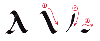

Make sure you get a steep angle on the downstrokes. If they are too shallow, your letters will sprawl out sideways untidily. Roman writing in general is efficient, and rustic capitals are particularly tall and compact.
Got the angle?
The next three – V, W and X – are also based on that heavy diagonal downstroke, like the first stroke of A or M. But the thin diagonal meets the thick diagonal at the baseline, instead of at the top of the letter:

Draw the heavy diagonal downstroke(s) first. Then, draw the very short horizontal cross-stroke to the top right. Trail back with the pen held at around 50-60 degrees for the thin diagonal.
This final line doesn't have to join perfectly, and sometimes crosses through the first downstroke.
As noted above, V stands in for U too.

W is a modern letter. But it is easy to see that if it had existed in Roman writing it would have looked like two Vs joined together.
X is fairly simple.

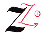
And the last letter of this calligraphy alphabet comes early in the sequence because it is nice and easy!
By now, the long single diagonal of Z should not give you any problems.
Keep your cross-strokes horizontal, with just a slight graceful undulation.
Roman writing (rustic capitals) – round letters
We’re done with diagonals – for now. Let’s try the two roundest letters in the alphabet.
Again, the initial downstroke is generally quite steep. Most rustic capital Os are not circular but distinctly oval:

The tail of rustic capital Q is rather elegant. If you have space, it can be extended a little as a minor flourish.
Then, as in many other majuscule alphabets, C and G bear a close resemblance:

(The second stroke should not be formed as a cut-off O-stroke. It is flatter to start with, and then curls in quite sharply at the end. Thus the overall aspect of C and G is slightly triangular, suggesting an egg balanced on its pointed end. By contrast, O and Q are more regular, symmetrical ovals.)
While you’re enjoying these curvaceous aspects of Roman writing, lets get S done:
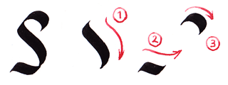
It is not an entirely regularly round letter. Maintain a steepish angle on that first, heavy diagonal, as for most of these letters. The lower pen-stroke is quite flat. The upper stroke curls in, like that of C and G.
Roman writing (rustic capitals) – vertical pen-strokes
Now for something completely different.
Do you remember that you are supposed to maintain a constant pen angle for writing calligraphy? Well ...
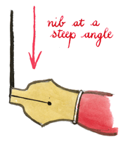
Most letters in the rustic capital alphabet are composed of tall vertical pen-strokes
These tall verticals can be written two ways.
The first is easier: very skinny all the way up and down.
The way you do this is: turn your pen (yes, I know!) so the nib is facing across to the left at almost 90 degrees (like the illustration on the left).
Then draw it downwards, producing a thin but steady vertical line – not the thinnest possible, but quite thin, to the baseline. That's your basic downstroke.
Or, alternatively ... (!)
The second method is the one I have used for all the rustic capitals in this tutorial.
This method creates lines that are skinny at the top but gradually flare out to become somewhat wider at the foot.
It is more difficult to do – but it looks good. (And is quite an impressive trick.)
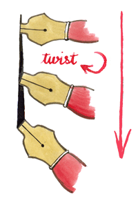
There is really no practical way of achieving the flared effect with a calligraphy nib other than by twisting.
So rest the nib lightly on the paper at around 90 degrees to begin with.
Then, while drawing the pen down, simultaneously start twisting the nib steadily clockwise.
By the bottom of the stroke it should be angled at about 45 degrees.
So how does your vertical look? Wobbly? Lumpy? Yep. Mine too. Keep practising. It gets much smoother after the first thirty attempts. (Honest.)
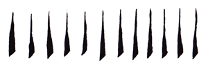
(I find it helps to start the downstroke with very light pressure, then increase the pressure as the pen angle changes. It seems to steady things.)
You can have a lot of fun practising this. Try going from 0 to 90 degrees in the course of a single downstroke, then from 90 to 0.
Try lifting the right-hand corner of the nib off for an even thinner line. You can create some wonderful calligraphic effects.

Enough ... back to Roman writing ...
So now for the actual rustic capital letters which contain a thin downstroke.
(If that fancy flared vertical seems too fiddly, just use the regular thin vertical with your pen held at around 85 degrees, ie almost straight across the page. It is equally authentic.)
First, try D and its friends:

D is very round. (Think dumpling.)
P is thin. (Like a pin.)
R has a steep diagonal leg which should not collide with its own foot on the first vertical. Either make that foot very small, or else draw the diagonal leg first and then add the foot afterwards.
Now, B:
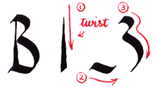
The rustic capital B is a lovely, almost Grecian-looking letter. Remember that it is taller than most of the alphabet by roughly 1.5 nibwidths.
B is one of the three tall letters in rustic Roman writing: they are B, F and L. (You can easily remember this with the phrase Big Fat Letters.)
Now for three rustic calligraphy capitals containing lots of horizontals:


Keep these fairly narrow. E is surprisingly slim. F is a tall letter, as noted above.
Notice how the foot on all three letters angles down a little while the cross-bars are perfectly horizontal.
Make sure your feet are lined up, that they are around the same size and that they progress at the same angle.

Now for the next two!

J is a modern letter. It combines a vertical, a cross-stroke and a curve.
And Y is a combination of two diagonals with a vertical. The only possible difficulty in writing Y is getting the proportions right with such short strokes.
Roman writing (rustic capitals) – hooked serifs
Again, we are going to conquer new calligraphic territory in this Roman writing lesson. Are you ready?
In many rustic capital letters, a vertical stroke starts with a hooked serif.
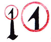
For letters such as B, D, E, R and F, you can leave this hook off. Instead, you create a serif with the beginning of the next stroke across the top of the vertical.
But H, I, K, L, and N all have one bare vertical stroke. The hooked serif lends definition and emphasis to the top of these weedy verticals.
There are two ways of forming this hooked serif.
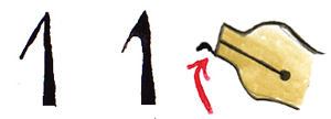
One method is to draw a short line at about 70 degrees up to the top of where the downstroke will start. Then remove the pen, alter the angle to almost 90 degrees (ie pointing directly off to the left) and draw the vertical.
While the ink is still wet, use the corner of the pen-nib to fill in the internal curve of the hook.
If there is not enough loose wet ink, touch your nib to one of the thin strokes to deposit a little more wet ink, and use that.
The other method of creating this calligraphic hook is trickier and much more satisfactory, and is probably the method used in the original Roman writing.
Start with a short upstroke at 60-70 degrees.
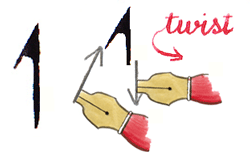
While drawing it, twist the nib around 10 degrees anti-clockwise.
Continue twisting the nib another 10 degres anticlockwise as you start into the downstroke of the vertical.
When the nib has come around to 90 degrees, stop twisting.
Obligingly, your nib will have produced a hook. (I hope.) It takes some practice but it is well worth putting in the time for the control it gives you over the nib.

Then of course there is still the rest of the vertical to draw! And if you want a flared vertical, you must now twist the nib back clockwise on the way down so it is at about 45 degrees by the baseline.
Heavens to Murgatroyd!
(If you are unfamiliar with that expression, I am not much surprised; but it's a good one, and I commend it to your use.)
I find it best to practise the hook twists and the vertical twists separately to begin with. Then have a go at merging them in one single, flowing movement of the pen.
The rustic capital letters requiring use of this hooked stroke in combination with horizontals are, in approximate order of difficulty I, L (a tall letter), H, N and K.
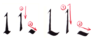
Notice that not only is L a tall letter, it also has a foot that descends quite pronouncedly below the baseline.

Five strokes to form a rustic capital H. It is a very handsome letter, though. Unlike other rustic capitals, H is wide by comparison with the modern version.
[Pause for breath ... and for more practise of those hooked, flaring downstrokes]
Ready?

Make sure N possesses that steep diagonal you perfected for A and M.
The diagonal should be slightly hollow-backed over its length. Don’t draw it as an upwards bulge.
K has a hooked vertical downstroke and a thin diagonal arm and a heavy diagonal leg. (Perhaps it’s just as well it was not too common in Roman writing.)

Draw a regular hooked downstroke to start with. Then, form the diagonal arm as for X and Y. Lastly, draw the heavy diagonal leg.
That's all the 25 letters of this particular Roman writing alphabet. I hope you will enjoy using rustic capitals. They deserve your attention.
Roman writing (rustic capitals) – letter spacing
Points to note:
- the longer strokes at the base of B, D, E, L, Q and to some extent T tend to descend more steeply than the shorter feet on other letters.
- The lower stroke of L and Q, especially, almost sits underneath the following letter.
- Roman writing shows very little decoration. It is mostly in the form of extended lines on X, L, Q, V etc where space allows in the margins or the top and bottom of the page.
Most Roman writing in capitals lends itself naturally to calligraphic headings and titles.

Rustic capitals are no exception. With a little playing around, you could turn a plain black set of letters into something quite exciting.
Ave, lector! Scripturi te salutant!
Have fun!
Go to the 'Roman alphabet' page
Return from 'Roman writing' to the Calligraphy Skills homepage