Gothic Calligraphy Step by Step – Part 3
Go back to Part 1
Go back to Part 2
Your Gothic calligraphy skills will already have improved through experience if you have worked through the first two pages. It’s time to move on to the elaborate, fiddly, final letters in this tutorial!
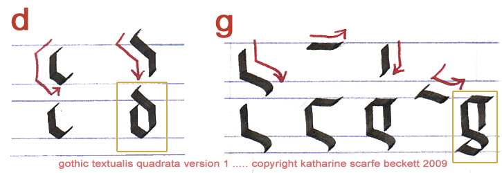
Let’s start with ‘d’ and ‘g’:

In fact, although these two letters may look like quite difficult Gothic calligraphy, both of them are much simpler than you’d think. You only take your pen off the page once for ‘d’, and ‘g’ is made of far fewer strokes than you’d imagine.
The important thing for you to bear in mind when forming both these letters is PROPORTION. If one element is too short or too long, it will throw out the whole shape of the letter. Aim for compactness, precision and symmetry.
If it doesn’t come right the first few times, don’t imagine that you won’t be able to do it. Shrug and have another go. Gothic calligraphy really does get simpler and better-looking the more often it’s done. After a while your hand seems to make the right moves almost automatically and you realize that all the elements in a letter were designed to fit together. You just have to get them the right size in relation to each other.
When you’re reasonably satisfied – please note I only said ‘reasonably’ – try out the following:
dig god dough muddling gouged gripped dogged gilded grudging peddling giggled
Notice that it’s not always easy to get two ‘d’s or two ‘g’s to sit happily next to each other. With Gothic ‘g’s especially, if you find that the second example is getting crowded out below the line, make sure that the descending portion of the first ‘g’ doesn’t stretch too far out to the right. The main factor in forming both letters happily is proportion and spacing. And practice. (Did I say that already?)
Now, here are two exotically zany Gothic calligraphy letters to take your mind off those doggone ‘d’s and ‘g’s:

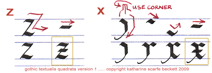
Strangely enough, ‘z’ is one of the simplest Gothic letters to write so long as you keep it simple. Try not to make its horizontals too long and wiggly; it’s quite a plain letter.
By contrast, ‘x’ is fiddlier to form. For this and a few other Gothic calligraphic forms, you need (ideally) to produce fine lines at different angles.
To do this, rotate the pen lightly and slightly anticlockwise with your fingers so as to lift the right-hand corner of the nib off the page. Then you can use the left-hand corner of the nib to draw out a thin line of ink (a ‘hairline’) extending from your letter.
If this is too tricky for the moment, make your ‘x’ plainer by using just a simple diagonal; it’s just as authentic that way.
With ‘z’ and ‘x’ you can now write the following to practise your spacing:
hex zip exit minx pixel quizzed pizzle mixture boxed exertion
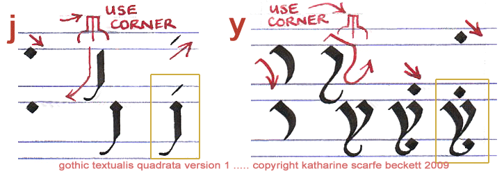
On now to ‘j’ and ‘y’. They are similar in that they both have tails that go below the line, and they are both quite modern letters which were not generally seen much in historical Gothic calligraphy.

The simpler of the two is ‘j’. However, ‘y’ is not difficult once you have seen how the two pieces fit together. Traditionally, ‘y’ carries a dot over it; you can leave it out if you prefer.
As you can see, the letter ‘y’ is another example of Gothic calligraphy which is easier to form if you can draw its tail with a hairline. While you’re drawing the nib downwards and round, twist it gently a little so that the right-hand corner comes off the page, and carry on drawing the tail of the ‘y’ with just the left-hand corner.
If that doesn’t work, draw the same slightly squiggly tail but with all of the nib-end held against the page as normal, for a thick-and-thin effect. (Leave off the final lozenge or it will look too heavy.) Some people prefer that form of ‘y’ anyway!
joy yoyo hajj yolk jolly day-job jaybird justify rejigged yellowy jejunum
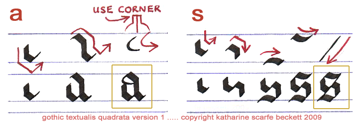
You may have been wondering what has happened to two of the commonest letters in the alphabet. They have not been forgotten. Here are the Gothic letters ‘a’ and ‘s’ to finish the sequence:

Form ‘a’ in two sections which are then joined by the final loop. If you can, turn the nib to draw this final looping stroke as a hairline with the left-hand corner, dragging a little ink with it from where you positioned the nib first at the top of the letter. If you can’t manage that yet, just draw a loop round with the pen nib held level on the page as normal.
The secret with ‘s’, as with most Gothic calligraphy, is not to draw any of the lines too long. It can take a little practice to fit together the two first sections so that they just touch at their corners in the centre and still leave enough room top and bottom for the next strokes. As with ‘c’ and ‘e’, start the first downward stroke a little below the final height of the letter. The diagonal joining line is more or less optional, depending on your taste.
General tip
Try to form Gothic calligraphy using lines which just barely touch, rather than which overlap each other. This gives it a more angular and elegant appearance, saves time and makes best use of your pen.
(Remember, the scribes of the thirteenth century did not evolve this script solely to make life difficult for themselves. They had a reason for developing each letterform, and they wanted to be able to produce texts quite efficiently. Supposing your letters sometimes don’t fit together right or their feet wander about on the base-lines – the primary cause is just lack of repetition and familiarity.)
Now that the whole of this Gothic alphabet is an open book to you, the following sequences will be a cinch:
as baa-lamb sassy sisters lassos aardvark sesame
straight pyjamas jealously abracadabra razzmatazz
sesquipedalian pandemonium assassinations exaggeratedly
circumnavigation antidisestablishmentarianism
floccinaucinihilipilification supercalifragilisticexpialidocious
Maybe you’d prefer to try out an old favourite:
the quick brown fox jumps over the lazy dog
Or -- now that you know it all -- you could even write this:
abcdefghijklmnopqrstuvwxyz
You can if you wish now find out about basic forms of ‘capital’ Gothic letters (majuscules). At the same time, you might like to find out how to draw some versals to use as decorated initials. Then you’re all set to write out deep dark Gothic poetry, create a certificate of vampirehood or even compose your own sonnet and then present it in Gothic script with a decorated border.
Congratulations on making it all the way to the end! I do hope you will use your Gothic calligraphy skills to create an outrageous effect somewhere.
Go back to Part 1 of this tutorial
Go back to Part 2 of this tutorial
Go to CAPITAL gothic letters A-Z
Return from 'Gothic Calligraphy Step by Step' to homepage