Decorated Letters
Creating decorated letters is not only a useful skill to employ in making your illuminated texts, greetings cards, scrapbooking and gifts. It's also a great pleasure whether as a calligrapher, a graphic artist, or just a human being looking to have some fun.
It's not calligraphy, as such. But the ability to decorate a letter or set of letters is certainly one of the core calligraphy skills.
One important thing to remember is that the foundation of all successful decorated letters is a clear letter-form to begin with, so that the reader can pay attention to the decoration in, on or surrounding it. (Gothic, as in the example above, is a slight exception in having quite ornamental letters to start with, but then gothic letters are not usually expected to be very legible!)
The general rule is that any flourishes added to the letter itself should not detract from its legibility if it is also going to be decorated.
Which calligraphy alphabet to use? Decorated letters are often Roman capitals, uncials, versals, or somewhat less commonly Celtic (insular half-uncial) or gothic capital letters. Popular and effective forms of decoration include:
- colour, whether in the letter or its surrounds or both
- patterns of flowers and/or foliage
- ornamental or geometric lines in or around the letter
- some kind of illustration inside the letter-form ('historiation')
- shine or sparkle in the form of gold, silver, glitter, pearlescent colour etc. ('illumination')
- varied texture – glued-on beads, fabric, paper etc
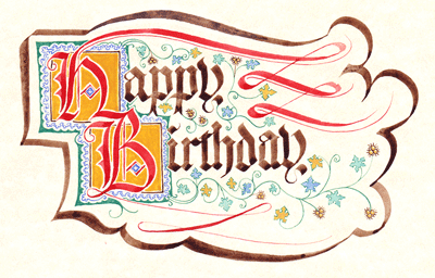
Many of these can be combined. Below, you can see a step-by-step breakdown of some of these decorative techniques used to create the 'Happy Birthday' above.
So, next time you're planning to write out a poem, a name-card or a birthday greeting, imagine something more than the utilitarian black squiggles that we usually read. Set letters free with art and fancy.
Easy decorated letters: a gothic example
This is a built-up decorating method I used at a local medieval fair recently. In return for their name in gothic decorated letters on 'parchment' paper, visitors were asked to make a donation to the event charity (the local town museum). They could donate as much or as little as they pleased. But I did say that the more silver coins crossed my palm, the more flourishes and ornament would be added to their name!
Here, I've used the text 'Happy Birthday'. Feel free to print or copy any part of the sequence for your own (non-commercial) use.
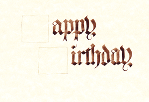
The first step is to decide where to place the decorated letters on the page – in this case, H and B. Remember, these letters will grab most of your reader's attention and carry most of the visual weight of the page, so they need to be balanced.
I judged by eye, based on how long the words would stretch across the page, and drew rough pencil boxes by hand to show their location. In this example, I wanted 'Birthday' to stretch well beyond 'Happy'.
Then, write any text which is not going to be decorated – in this case, 'appy' and 'irthday'. It's important to get the plain text written first. That way, you know how much space you have for the decorated letters and also exactly where that space is.
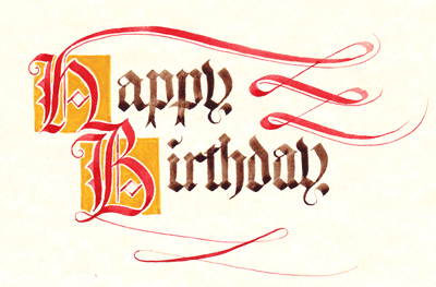
The first decorative technique I've used is to change the colour of the initial letter. I'm using the traditional vermilion of the European Middle Ages (here, mixed from cadmium red, cadmium orange and a little ochre).
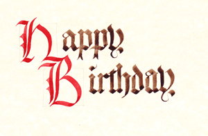
For a not-too-ornate decorated letter, this can be enough in itself. In fact, red lettering for decoration and emphasis has always been a very popular technique with its own fancy name: rubrication. (It's the origin of the 'red-top' on tabloid newspapers, as well as 'red-letter' days on calendars.)
Notice that I've left the letters slightly incomplete. That's because there's plenty of room on the page for some flourishes, a feature of many fancy letters and therefore something to consider for your decorated letters too – so long as they don't make them too hard to read.
(Because 'Happy Birthday' is such an easy phrase to recognise, I can get away with a bit more fancy-schmancy stuff than if it were a more difficult text.) So, flourish away!
You might notice I've used two nibs: the broad-edged nib which I had used to write the letters with, and a thin, flexible, copperplate nib for finer flourishes and lines.
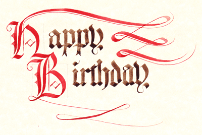
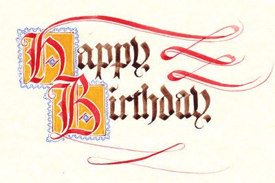
Next, in imitation of the great old illuminated manuscripts, and also because it's very easy to do, I've painted a coloured area around each letter. This 'gold' square is actually just mixed up from ochre, a little cadmium orange, cadmium yellow and a touch of warm sepia. It gives the right weight and colour, but of course real gold leaf or even shell gold would look far more reflective and dramatic.
Notice how the gold-coloured square really focuses attention on the initial letter and holds it in place on the page. The white line left all around the letter helps make it crisper and easier to read. If the yellow were painted right up to the red, the letter would appear to sink into the background.
Next: ornamental line. Page decorators in the Middle Ages were keen on a kind of scallop pattern which turns up in various forms in different illuminated letters and borders. I've created one here which looks like a row of little clubs from a deck of cards: it's relatively easy to draw quickly and if you get it slightly wrong here and there it doesn't much affect the overall look and feel of your decorated letters.
Here's a close-up so you can see that it's all pretty rough and ready.
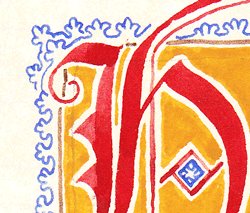
(In case you're interested, the colour is ultramarine blue gouache let down with a little viridian green, lamp-black and white so it's not too glaringly blue. In a medieval manuscript it would have been either the fabled lapis-lazuli or else azurite.)
So far, so good – and when I was writing gothic names for passers-by, quite a few were content with just that much decoration. But as you're still with me (I'm impressed!) how about we add some foliage and flowers just to see what it looks like? Oh – and, while we're at it, a little more weight of colour around the initials?
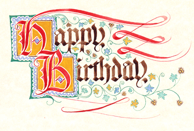
Again, I've stuck to a typical fourteenth-century design for these decorated letters, with stylised ivy leaves in unrealistic but pleasingly bright colours, and little 'gold' burrs emphasised with sepia.
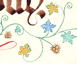
The outlining in a traditional gothic manuscript would more usually be a heavy black, but sepia gives a warmer, softer effect. Tip: draw the main branches and the leaves first, and then join them up with leaf-stems drawn in afterwards. This helps get everything well placed and proportioned.
Lastly, since the decoration on these letters has now in fact gone rather over-the-top, the whole design needs some steadying influence. A heavy outline around the whole lot will help keep it in one place, as it were (see the design at the top of this page). I used the same nib I used to write the text, with a few doubled lines for extra weight.
It may not be great calligraphic art, but it was fun to doodle, it would make its recipient happy, and it at least illustrates the basic principles for creating fancy decorated letters!
Of course, there are hundreds of other ways to create decorated letters. I hope the ideas above will inspire you to use colour, line and illustration in a variety of ways to bring your own alphabet to life.
Go to 'Make Your Own Card' — another Gothic doodle exercise :-)
Return from Decorated Letters to the Calligraphy Skills homepage