Calligraphy in the copperplate style
The description 'calligraphy in a copperplate style' can cover a spectrum of scripts from the seventeenth through twentieth centuries (not counting the late-twentieth-century revival and 'modern' calligraphy). Strictly, 'in the copperplate style' should mean 'a handwritten imitation of eighteenth century engraved lettering that in turn was "improving upon" earlier English Roundhand'.
I'm not so sure that 'Copperplate' was originally an attempt to imitate engraved letters. But today's copperplate calligraphers do use steel nibs to imitate engraved examples and it's usually accepted that the way to write a calligraphic copperplate script is to use a pointed steel nib because it produces the rounded, swelling line typical of the copper-plate engravings.
Not me, though, not this week. Quills or bust.
The way I see it, quills continued in official and general use right up into the twentieth century, and English Roundhand also continued to be used (on legal documents, for example) into the 'copperplate' period. Something very like a 'copperplate' hand existed before steel nibs were in general use. So, defining calligraphic copperplate or 'copperplate handwriting' (if there is such a thing) is not as simple as saying 'copperplate = steel nibs = eighteenth/nineteenth centuries'.
There are ways to cut a quill to produce a copperplate style of
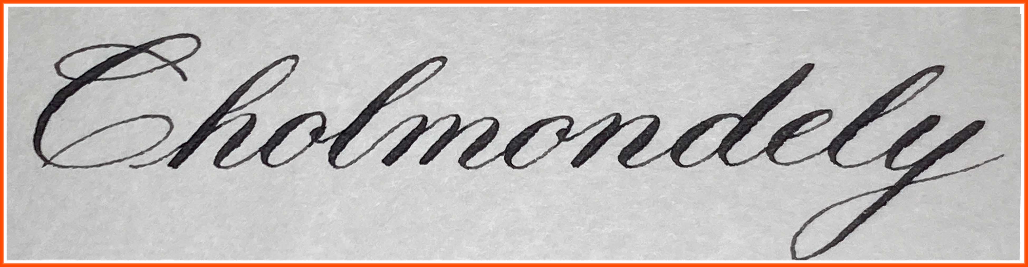
script. All the examples on this page were written using quills and some horrible old Higgins Eternal ink on a piece of fake parchment paper. No lines at all were ruled.
As a handwriting teacher, I know, deep in my teacherly bones, that generations of English schoolchildren never would have put up with one tenth of what calligraphers put themselves through to 'write copperplate'. The original writers of these hands did not use elbow nibs, they did not slant their paper or rule 55-degree lines. The copperplate family of scripts comprises practical handwritings, just as uncial, Carolingian minuscule, gothic, secretary, italic, etc were practical handwritings. And, in each generation, many writers turned out very beautiful handwriting which qualify as calligraphy.
I'm not saying 'handwriting is calligraphy'. But calligraphy is beautiful handwriting. It's okay to start with copperplate as handwriting, figure out how to write it, and then take it as far as you like on the path of perfectionism.
'Copperplate' calligraphy with a quill or a pointed pen
When you read the old handwriting manuals, they are big on grip, ie how you hold your writing implement, and sometimes also on the shape of the tip of the writing implement (traditionally, a heat-treated goose-quill).
The combo of grip with tip, or how you hold what shape of nib, determines the character of the written trace you will leave behind.
A third factor, absolutely inseparable from grip and tip, is how you move the pen to produce that trace. Calligraphy, like all handwriting, is dynamic.
Letter-forms naturally follow the writing function, as defined by grip, tip, & movement.
Therefore, instead of unusual solutions like using a specially manufactured elbow nib or elbow holder and turning your paper through x degrees and spending hours learning to read everything sideways, maybe it's possible to learn to write (if not calligraphy) at least a passably calligraphic script in the copperplate style by working with the same tools, movements and hand positions that the original writers of copperplate did. And then the letter-forms would naturally follow the writing function as defined by grip, tip and movement.
Hear ye, hear ye. Slavish imitation of form alone for form's sake is how we ended up with every horrible writing style that has ever existed, from Merovingian minuscule to Comic Sans! Writers of the world unite! You have nothing to lose but your ligatures!
Copperplate: grip and tip
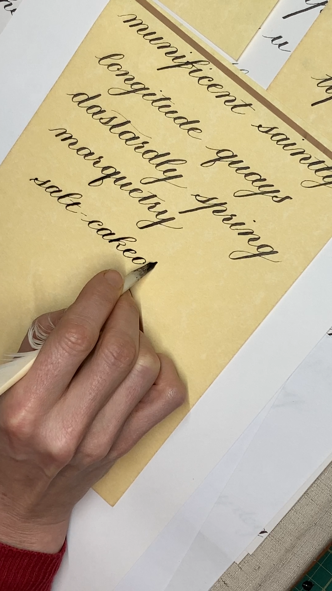
Grip: Hold the pen between your index finger, bent thumb and second finger so that the pen is under your first finger but almost over the first joint of the second finger, protruding between them. Thumb is on the left, second finger to the right and under, in something like an ordinary tripod grip. Now, when your wrist is turned downwards, the pen points off somewhat to the right, in between the underside of the first joint of the index finger and the side of the nail of the second finger.
The other two fingers are tucked up into your palm and you rest on them. Or at least don't use them.
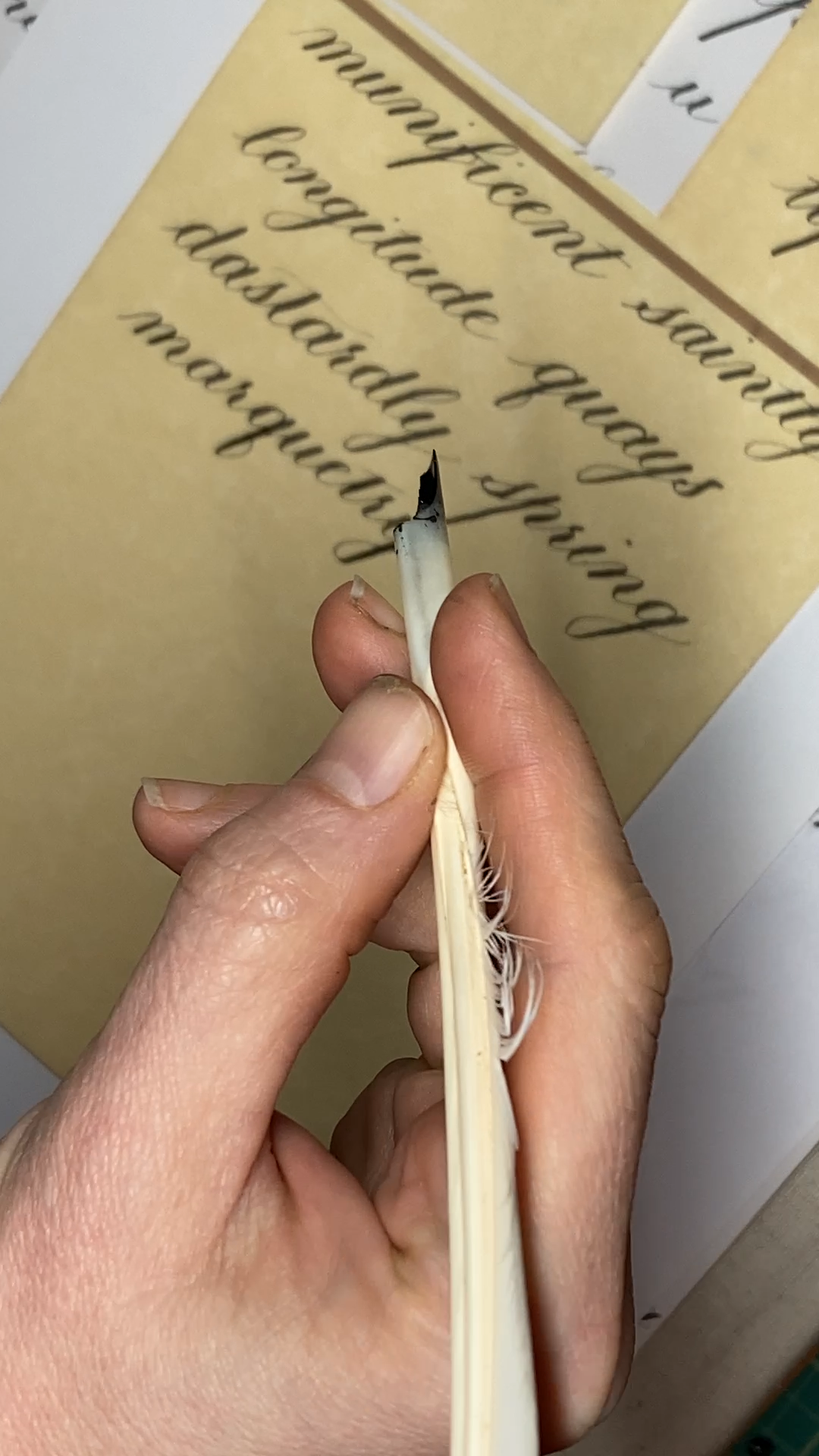
This grip may feel utterly counter-intuitive to start with. But it's how Henry Gordon's handwriting manual at the end of the nineteenth century says to do it, and it gets the nib pointing off to the right, which is the only way a steel nib (or a pressure quill) works. Relax and after a while it becomes second nature.
When you put your hand to paper, the inner wrist faces down. This is important. (Scroll down for photo.) The hand points straight up the page. The paper is off a little to the right, but square, not angled.
Check out these historical images of different pen-holds for more on this.
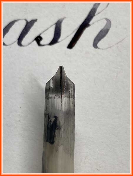
Tip: The way to get the swelling downstrokes is by using pressure, as well as the shape of the nib. If using a quill, the shape of the nib gives flat tops to plain downstrokes. The best way to achieve both is to cut the nib fine, and slightly left-oblique, so that the acute-angled, longer tine is on the right, and the shorter, obtuse one is on the left.
If you're using a standard steel pressure nib, flat tops are a bit trickier. You have to 'spring' the tines apart with a quick, gentle pressure at the very beginning of the stroke, then pull downwards without varying the pressure. At the bottom of a stroke, let the tines snap back together for a clean straight line.
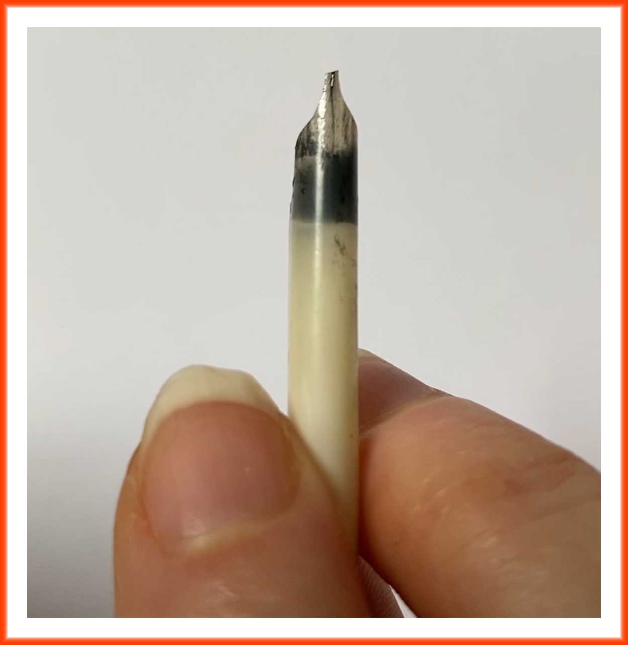
This oblique cut on the tip of the quill gives flat tops to the letters that need it. It also sometimes results in a distinctive, slight notch to the top of the downstroke, visible in some old examples.
The slit must be fairly long to allow the tines
to spread, with the nib width relatively fine. The shoulders should be
quite long, too, so that the tines do not get too tired.
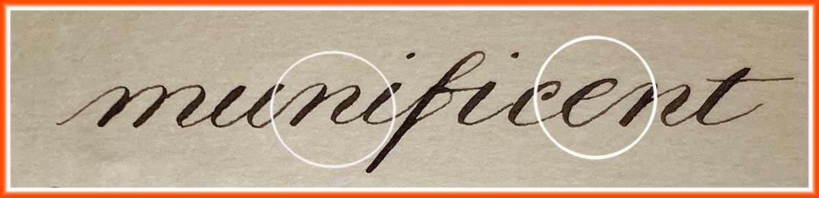
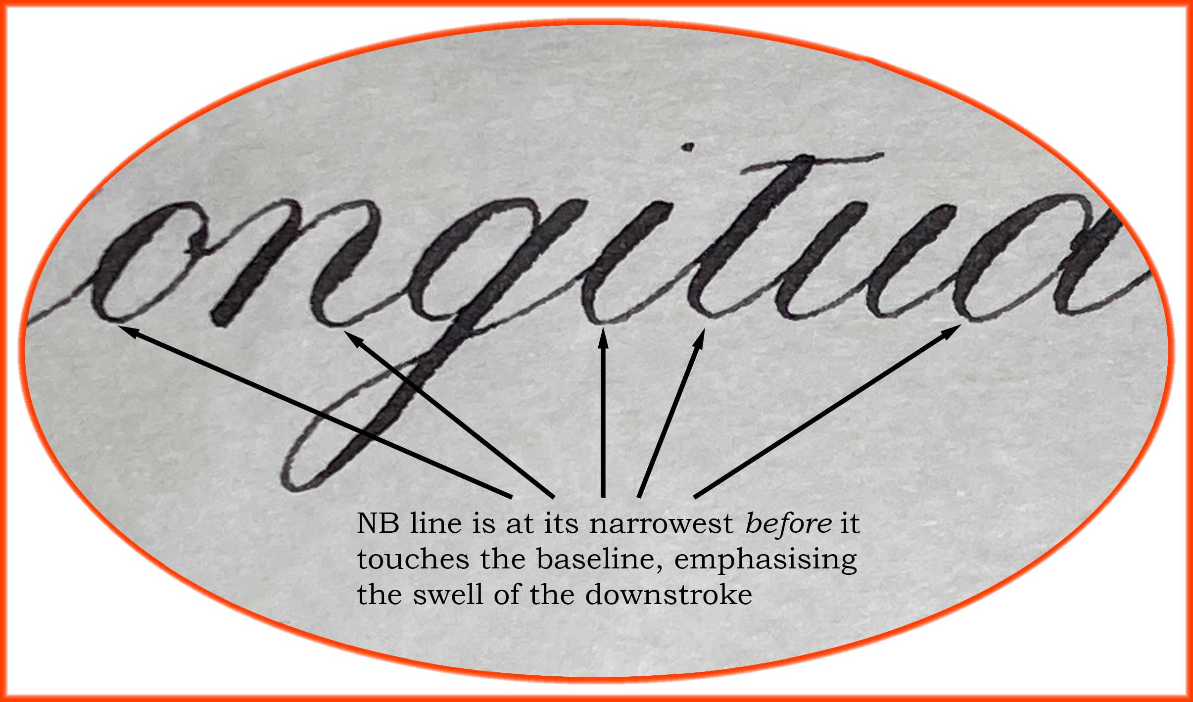
Written using a left-oblique quill – note the swelling line produced by (a) holding the pen pointing a little to the right, (b) using pressure in the middle of the stroke to build on the width of line already produced by the broad-edged nib.
Movement: The new hand position and the fine-cut nib mean you can't roll from tine to tine as in Roundhand, nor sweep up and down as in Italic. You have to push and pull with thumb and first finger, pivoting the pen on the first joint of the second finger. Wrist movement is important for smooth curves. The weight of the hand does some of the work of providing pressure. You pull back towards you for a downstroke, push for an upstroke. Pulls are heavier, towards your hand and into the paper; pushes are lighter and move away and up off the paper.
The result should be a series of narrowly spaced, quite tightly
controlled parallel lines with a distinctive thick-and-thin 'wave' to them.
The pen is used
predominantly on its right tine for the fine upstrokes, and by pressing
gently on the downstrokes you get full contact of the nib followed by the tines
splitting apart, resulting in a classically Copperplate-calligraphic
swelling line. The new cut of the pen results in a different aspect to
the transition between a heavy downstroke and a light upstroke than you
see with a straight-cut or left-slanted tip to the nib. The transition is much lighter in a copperplate style of calligraphy.
A quill cut and used this way does not give exactly the same results as a steel nib, but it can be hard to tell in some manuscripts which tool has been used.