How to draw bubble letters, p. 2
(S Z N ... E M W ... P R F)
As mentioned in part 1, it's worth knowing how to draw bubble letters because of their fun appearance, simplicity (once you know how) and usefulness for all kinds of cheerful lettering purposes (party invitations, 'Keep Out' signs, totally upbeat and legal graffiti, etc.)
This page continues with my own method showing how to draw bubble letters based on a circle, so that they look very bulgy. The image comes first, then some notes on how to draw the letter. (In case you haven't seen the first page, it explains more about this alphabet and shows you the instructions for the simpler letters O Q I ... D B ... C V U ... A H.)
Here we go with some slightly more complex bubble letters containing lovely puffy diagonals – S, Z and N:
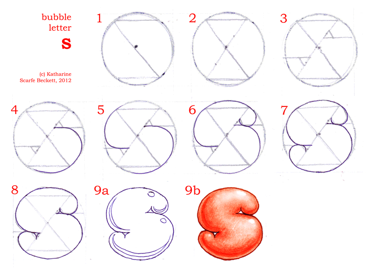
This bubble-letter 'S' is cute, I think, with its little blobby nose and tail. The important steps are 2 and 3. It's not too clear on the diagram above but what I did in 2 was to place a dot on the bottom-left-to-top-right diagonal, halfway between the centre and the outer edge. The little triangular holes that define the S-shape should be positioned with their innermost edge centred on those dots. Notice too how the triangles are defined further by the two horizontal lines added in step 3. That horizontal is what makes the nice bulgy, bubblish 'chest' and 'back' of the letter, and makes it recognisable as an 'S'.
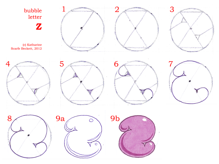
Yes this does look like a bendy 2. It reads just fine as a 'Z', though. Notice that although this is very similar to a backwards S it is not quite the same. The dividing lines emerging from the little internal triangles point down to the left and up to the right, not straight across.
As a side-note on this, I tried constructing the 'Z' as a straightforward mirror-image of the 'S' and it didn't work. This is because 'Z' is characterised by a strong, straight diagonal – whereas 'S' is very much defined by the horizontal tendency in the middle of its sinuous bend. The different angles on the internal triangles are clues that help the eye recognise and read the different letters. I hadn't realised that working out how to draw bubble letters would also teach me about basic typography in the Roman alphabet :-)

Having seen how to draw bubble letters 'S' and 'Z' you can see clearly how 'N' works. It's just a Z rotated through 90 degrees. The internal triangles and dividing line define a strong diagonal line in the same way so that the letter is easily recognisable.
Right! Now we can go one stage more complicated again, and look at 'E', 'M', and 'W'. By looking at their ordinary printed forms, you'll see they each have three protrusions. So, lots of little blob shapes coming up.
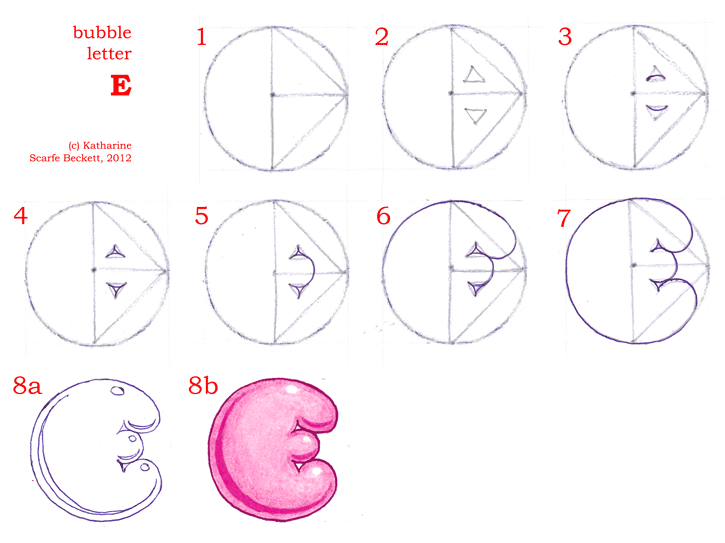
The important thing to note while drawing these three letters is that the little central blob does not extend as far as the construction circle. It is a small circular form tucked in between the two longer arms. If you think about how E, M and W are often written, with shorter middle sections, you can see how this makes sense for all three letters.
Therefore, as you will see if you crane your neck round through ninety degrees left and right, 'E' all by itself pretty much tells you how to draw bubble letters 'M' and 'W' too – you just rotate the form and move the highlights/shadows.
Still, the three letters all show slightly different characters, because of their different orientations. Bubble-letter 'E' to me looks a little frowning but at the same time quite jolly underneath. Perhaps he is wondering where he left his beer, or else she is telling off her nephew for being cheeky while actually thinking it's quite funny.
'M', on the other hand, looks a little shy:
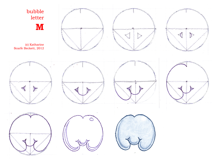
... at least, I think it looks shy, hence the soft pale unaggressive blue. It's something about its wee round nose tucked between its two front paws that makes it look rather sweet and unassuming.
And 'W' is a different character again:
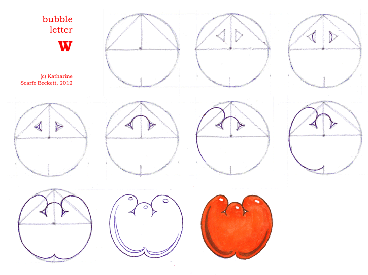
Something about the attitude of bubbly 'W', with its big base topped off by three diminutive sparkly bulges, seems quite exuberant. So another thing I learned from learning how to draw bubble letters is that even the same form can take on very different characteristics in different positions.
Note: I've shaded and coloured all the letters in this bubble alphabet in slightly different styles. As you can see, the shading on this 'W' is quite hard-edged compared with the 'S' earlier. It looks more stylised, less marshmallowy. It all depends what effect you want.
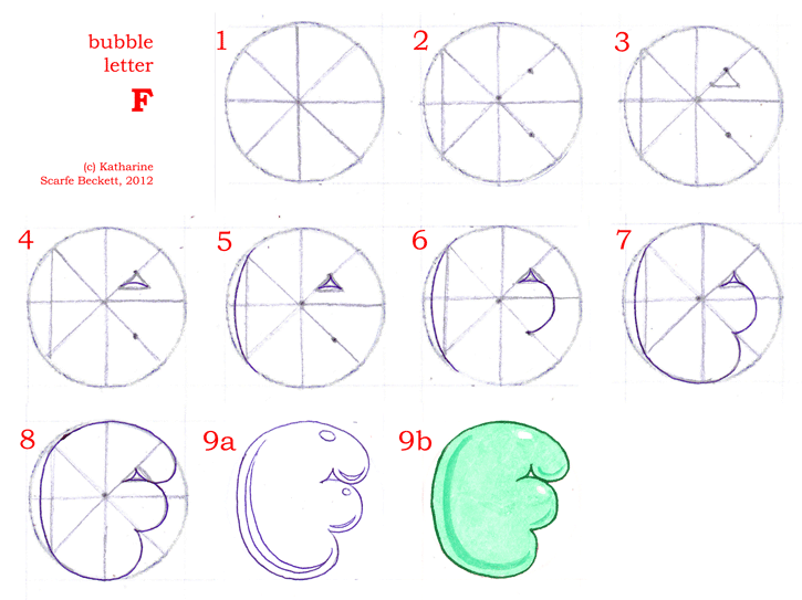
The final bubble letters on this page are 'P', 'R', and 'F'. If you look at them in this sentence, you can see that they belong together because all three consist basically of a long left-hand vertical with another shape tacked on at top right. Here they are as bubble letters:
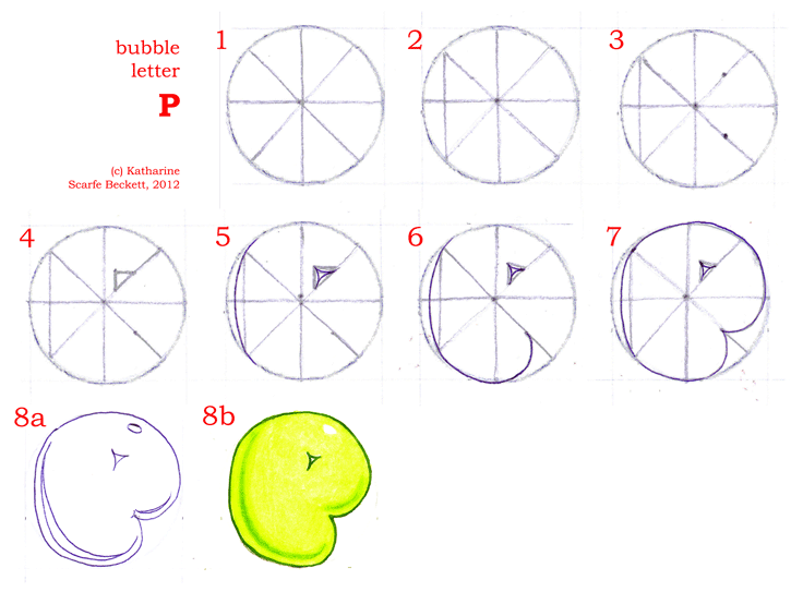
'P' only looks this complicated because I wanted to find a way of standardising how to draw bubble letters as a consistently designed alphabet. So I came up with this pie-slice method to help locate the different elements. The little triangular hole is placed halfway along one diagonal. The division between the bowl of the 'P' and its stem occurs halfway along another diagonal. Then it's easy to draw the same curves each time and get the same 'P'.
Note that this letter, and 'F' and 'R' too, make use of that long shallow curve down the back of the letter that we saw in 'D' and 'B'. Draw it in between the straight vertical and the construction circle boundary. It helps the eye to recognise the letter when it sees that suggestion of a straight line, instead of a full circular curve.
O.K., here are 'R' and 'F' together:
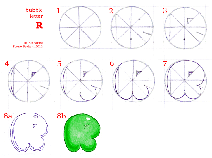
I am not entirely satisfied with 'R'. I spent ages working out how to draw bubble letters 'R', 'Z' and 'U'. 'Z' worked out just fine when I realised I had to stop thinking of it as a backwards 'S'. But 'R' and 'U' ended up somewhat compromised because however much I played around with them, they always ended up shorter than the other letters in proportion to their width. It's about the stem on the 'U' and it's that extra dratted leg on the 'R' ... I could extend it a little, but then it wouldn't fit inside a circle, and the basic principle of this alphabet is the letters fit into a circle. So, if you come up with a better idea, I'd be delighted to know it, and you'll get full credit :-)
Anyway, things to note about 'R' and 'F' are: place the diagonals carefully, and think about the balance of the whole letter as you are drawing it. At this stage of how to draw bubble letters it is about judgment almost as much as following the formula. How much you let the central horizontal line in the 'F' stick out, and how you balance the length of the legs in the R, are quite delicate questions, and it may require a little trial and error before you find the shape you like.
Once you are done with those, you may like to move on to page three for the remainder of the alphabet: T Y ... L X K ... G J
The usual copyright notices apply: use these instructions as much as you like, print them, teach with them (if the lessons are free), improve upon them, etc – but don't sell the instructions or the images in any form. You can do that with the much better and strikingly different alphabet that you design yourself. These ones are free.
Go to page 1 of 'How to Draw Bubble Letters' (O Q I, D B, C V U, A H)
Return to 'Bubble Letters' (overview, and other links)
Return from 'How to Draw Bubble Letters, p. 2' to the homepage