Colour temperature (lighting) for calligraphy & artwork
Any light has its own 'colour temperature', and any light source adds its particular colour into your calligraphy or artwork, like a filter.
Which means that if you spend a month painting a wonderful Book of Hours page under yellow electric light and then display it in daylight, all your nicely judged colours and colour balances and colour relationships are going to go phut.
So, to prevent that happening, we ought to briefly discuss colour temperature.
And Kelvins. Yes, Kelvins.
Kelvins, as you may or may not recall from your schoolday science-for-calligraphy classes, are the standard scientific units for measuring temperature. They're abbreviated K. 0 degrees C is 273 degrees Kelvin, water boils at 373K, and so on.
Stay with me. Stay with me. (Please. There's a good picture further down. Not that church-looking one, no, an even better one.)
Usefully, Kelvins also describe light colour because stuff emits quite specific colours of light as it heats up: at lower temperatures, it's red-hot (lava, molten metal) and then, as it gets hotter, it moves up to yellow-hot, then white-hot, and then blue-hot (like some stars). Hence, the term 'colour temperature'.
For you, the calligrapher-artist, this means: light with fewer Kelvins is orange or peach; light with more Kelvins is yellowish; and lots of Kelvins means the light is whiteish going up to blueish.
It's good to know this so you can judge in advance what kind of colour a particular light is going to add into your artwork. If you want to buy an adjustable desk lamp, for example, you can ask the right questions before you get it home.
I say more about what number of Kelvins correspond with what colour temperature and what kind of lighting below.
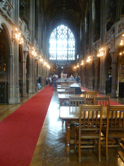
Just to make the point about different light sources having different colour qualities, look at this photograph and the difference in colour and brightness between the daylight through the window and the electric light from the wall-lamps. The electric is distinctly peachy-yellow. The daylight is quite blue-white. (That window is nearly all transparent glass — the light isn't being coloured as it enters.)
The photo, btw, is from inside the fabulous John Rylands Library in Manchester, England.
Colour temperature is not the same as artistic colour 'warmth' and 'coolness'
Artists talk about 'cool' and 'warm' colours. Blues and greens are cool, reds and oranges are warm, yellows and purples are kind of moveable depending on how they're mixed. This is an emotional or human-experience description, I guess, because red and orange mean warm things like blood, fire, eyelids closed against sunlight, and we see them as 'coming closer'. Blue means cold things like water and ice and cloud shadows, and green is cool foliage and algae, and we see these as 'receding' or 'further away'.
Colour-temperature, as measured in Kelvins, is almost exactly the other way round, because it refers to the notional heat of an object emitting light. In this system, red is cooler, blue is hotter. Yellow-white is somewhere in the middle.
So the daylight in the library photo above would be termed a 'cool' colour in normal artistic lingo, but would be described as higher and therefore hotter on the Kelvin scale, because objects have to be pretty darn hot before they radiate blue-white. The electric lamplight is 'warm' to an artist's way of thinking, but that yellow-peach would be described as lower and therefore 'cooler' on the Kelvin scale because its colour corresponds with a not-so-hotly-radiant object.
Note also that colour temperature (Kelvins) is considered separately from light brilliance (which is measured in lumens in science, and in watts or watt equivalents in the regular UK household. And of course candlepower in medieval monasteries.)
Hope that all made sense.
Colour temperatures change how your artwork looks
Below, you can see the same piece of artwork viewed in daylight, in a mixture of daylight and electric incandescent light, and in just the electric incandescent light alone.
Can you see a small black circle in the right of each picture, round a green part of the lettering? O.K. ... The swatches below each image are in fact a colour sample taken from the pixels in the same tiny patch of green in the middle of each black circle.
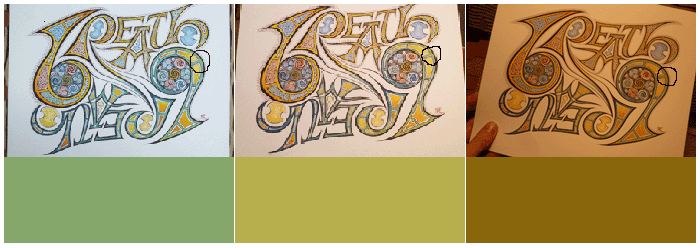
See how differently the camera saw the same colour in the different lights? The eye behaves in a similar way. If you're working in one light, and then the piece is viewed in a different light, it's quite probably going to look completely different colours.
It's also harder to work in the electric light because it's dimmer.
So think about where your calligraphy is ultimately going to be seen/displayed, and also think about whether you want it to look very different if the lighting changes.
- Typical artificial lighting – from normal old-fashioned incandescent household bulbs and halogen bulbs – is quite warm and yellow, 2500-3500K. It will make your artwork look yellower and you will unconsciously tend to compensate by painting in cooler colours. 'Daylight bulbs' compensate for this by adding a nicely judged quantity of blue into the light colour before it hits your artwork.
- Fluorescent light is usually colder and whiter (4000-6500K).
- LEDs can vary but typically give a brilliant cold white light in a similar range (4000-6500K). I find this a useful light temperature to work with and have a small portable desklamp which adds it when I want it.
- Daylight is white/bluish (6500-7500K). Direct sunlight is yellowish-white, and dazzling; horrid to work in.
- The famous artist's 'north-light' is pretty darn blue (8000+K). (Let's just pause here a moment to wonder how much artwork is actually viewed under a north light these days. )
I recommend finding a white-to-blue-white lamp or lightbulb, between 6000K (lowest/warmest) and 7000K. This is because most workspaces have ceiling bulbs that give you background light in an incandescent yellowish colour. So by adding in a whiter/bluer colour value with a fully adjustable desk lamp, you can mix to taste.
Return from 'Colour Temperature' to the homepage