How to draw bubble letters, p. 3
This page shows you how to draw bubble letters T and Y; L, X and K; and J and G. It's not as random as it seems – these letters are more complicated to draw using this 'fill-the-circle' method than the other letters of the alphabet detailed on the first and second pages. They're grouped according to similarity of construction technique, so if you learn one of them, you can draw the others in the group easily too.
If you're looking for a simpler method to create balloon letters that are still fun to read but skinnier and less characterful than these supercurvy specimens, you might prefer either the 'outlines' or 'ovals' methods of construction. I designed this alphabet because I wanted to work out how to draw bubble letters that really bulge. Hence the use of a circle as the basic construction outline.
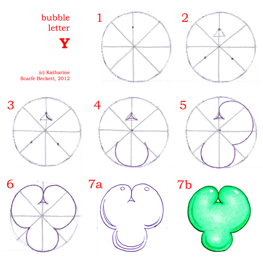
As on previous pages, the images that show you the step-by-step instructions appear first, followed by a few notes on individual letters. Here are 'T' and 'Y' to start with. Have fun!
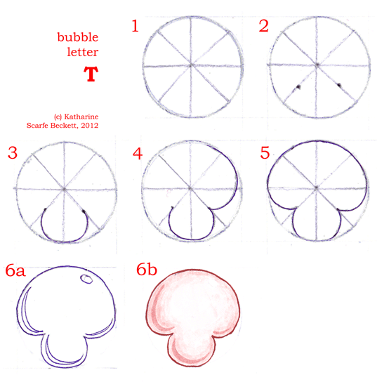
As you can see, 'T' is not that complicated but it is a new kind of shape. To get it to look legible, you need to think a little about the way the top bulges out of the stem. It should be both bulgy and smooth enough to look properly 'inflated', and also contain a hint of a horizontal line, so the eye can read it as 'T'. If you draw the undercurve of the 'cross-stroke' too low (too close to the stem), it will look droopy instead of bubbly. If you draw it too high (too big a gap between stem and top) the letter will stop looking like a 'T' and will just resemble a blob. Basically, if it comes out looking like a mushroom, it is probably about right :-)
'Y' is very similar indeed, with two differences. The first, most obvious difference is the triangle-and-dividing-line in the top, to make the two upper branches of the letter. If you have already seen how to draw bubble letters D, B, etc, this will be familiar. The second difference between 'T' and 'Y' is less obvious but just as important: the angle of the curve between the stem and the arms of the 'Y' is wider than on the 'T'. The curve springs upwards more readily, giving the viewer no sense of a horizontal line. This is of course because the arms on a 'Y' are diagonals, whereas a 'T' is characterised by one long horizontal.
(T. Y? Because I'm British. ... Sorry.)
Moving swiftly on to 'L', 'X' and 'K', you may ask why 'L' is included here, as it does not contain the diagonals of the other two letters. Well, 'L' is like an expanded version of one section of the other two letters:
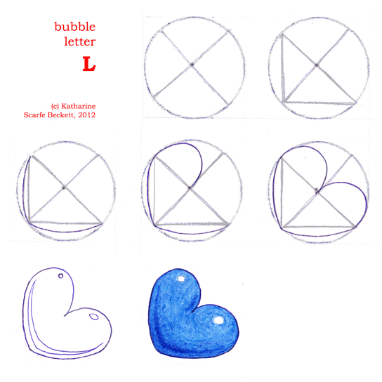
It contains two long, shallow curves on the left and at the bottom, to represent the straight lines that make up an ordinary 'L', and then the middle is composed of two almost-circular bulges. It is basically a bubble heart tipped onto its side. Where you have to use your judgment is in how deep to take the division. As you can see, I use the centre-dot as a guide for the depth of the division line. Additionally, I then make sure the little white highlights are different sizes – smaller and rounder on top, larger and longer on the bottom leg. This strengthens the idea that the lower, horizontal leg of the 'L' is the one that the letter is sitting on, and so helps it look more 'L'-like.
Now for 'X', which is composed of four little bulges, like the stems on 'T' and 'Y' but set out diagonally opposite each other:
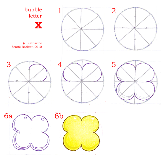
A simple bubble-letter, yes? The challenge is to get all four curves relatively equal and symmetrical. Bubble-letter 'X' also doubles as a bubble-flower or possibly, in the above case, a bubble-butter-sculpture.
Here now is 'K', which combines elements of both 'L' and 'X':
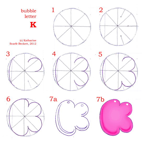
I know; the dividing lines look annoyingly fiddly to position. It's the same problem with this letter as with 'R' and 'U' – too many leggy bits sticking out inside the construction circle and getting in each other's way. But I think in terms of how to draw bubble letters that do fit inside a circle, this is the best that I can manage for 'K'. It does read legibly. You could try narrowing the back to give more room for the diagonal arm and leg, but it makes the whole letter look rather thin and un-bubble-like.
O.K. On to the last two letters of the Calligraphy Skills how-to-draw-bubble-letters free online tutorial. They are 'G' and 'J', both quite complex, but interestingly similar to one another:
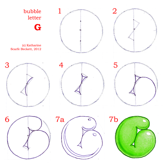
I had the most fun designing 'G', and I think it's still my favourite. It looks like a nightclub bouncer waving one fist.
I hope you can see the construction principles. Draw a vertical line bisecting the original construction circle. Then, as if the circle is a clockface, work out where one o'clock is, and draw a line from one o'clock through the centre. Find the halfway points between the centre and the circumference and draw lines from them to meet the one-o'clock line at right angles. And that is it. Everything else is just filling in the curves.
The triangles have to be slanted because the letterform just doesn't work as well if you draw the triangles using horizontal lines. If you've already worked through the instructions on how to draw bubble letters 'S', 'Z' and 'N' you will recall that the angles of the triangles in 'S' and 'Z' make all the difference between suggesting a horizontal in 'S' and a diagonal in 'Z' as far as the reading eye is concerned. It's a similar principle here.
Compare 'J':
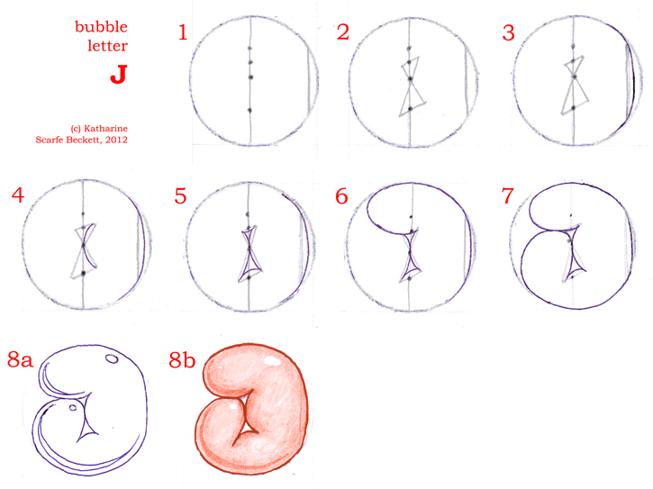
If you look carefully, you'll see that 'J' is just a 'G' flipped horizontally with a straight back, swollen head and a tiny fist.
O.K., you say, but there's too many little dots. Let me explain. The central dot is the one your compass-point made while drawing the circle. Draw a vertical line through it. Halfway between the centre and the circumference, on the vertical line, draw another two dots, one above, one below. And in between the centre and the upper-halfway dot, draw one more dot. That's it. Four easy dots. (You only use three of them in actually drawing the letter; the upper-halfway dot is just there so you have a guide to find the fourth one.)
Third and final apology of the page: sorry for the different sizes of image. Some of the instructions are four circles across, some three, but I managed to save them all to the same number of pixels. Duh.
And that's the end of the alphabet and of my thoughts on how to draw bubble letters that genuinely look like bubbles. Thank you for reading this far and I hope you have had fun.
Return to 'Bubble Letters' (overview and other links)
Return from 'How to Draw Bubble Letters 3' to the Calligraphy Skills homepage