Make your own card 1:
Gothic doodle
Turn off those stressful cat videos, relax, and make your own card for the next hour or so instead. It's a calligraphic no-brainer!
(Here's a superb cat for you anyway, by Siyah Kalem, 15th-century Turkic genius:)
 Hazine 2160, f. 55b")
Let's assume that today, like me and the cat, you don’t want to try to get everything perfect to make your own card. You just want to have fun.
And what if you make a mistake, create an effect you don't like, or the card doesn't turn out how you wanted? No problem. This time, it's not about 'practice makes perfect', but just the pleasure of doodling with whatever you've got.
(As the master of calligraphy, Edward Johnston, would tell you: sometimes the best way to practise calligraphy skills is not to futz about writing more alphabets but to make a finished piece. Now.)
Make your own card: tools & materials
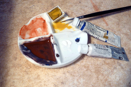
First, gather enough tools and materials, but not too many.
In or around the desk I’ve quickly found the following:
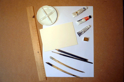
- mixing palette, newly washed, yay!
- wooden ruler (if you're wondering, I tried to sandpaper off the markings to make it acceptable for a medieval fair)
- printer paper, for scrap
- artist's colours – red, yellow, blue and white are all you’ll really need for this exercise – I've selected ultramarine blue (a medieval-looking colour), vermilion (ditto), titanium white (good coverage) and ochre (useful for gold effects)
- a rectangular scrap of heavy, cream, watercolour card (400gsm I think) left over from a commission last Christmas
- a 4H pencil
- a size 1 sable spotter (a useful size of brush) or any good fine-pointed small round paintbrush
- two rather horrible-looking bent-nibbed quill pens I cut more than a year ago – one wide, one narrow – they might work, they might not – use your pens of choice
- (not shown) a slanted board to work on, cup of rinse-water, eraser, audio entertainment, and insouciant attitude
You may not have just the same materials from which to make your own card, and the ones I’ve found are not necessarily ideal – for example, my piece of card scrap is too small to fold – but it’s all about improvisation. 'Start where you are, use what you have, do what you can,' and all that.
Ruling up and laying out
Usually, to make your own card or indeed any calligraphic piece, you would select a text, experiment with preliminary sketches and layouts, practise the writing of final piece, practise more on the type of paper that will be used, and then choose the final paper size and rule up according to the nature of the text to be written. And even then you might end up doing the final piece two or three or four times.
Personally, I have no idea what I’m going to write, and no intention of spending time trying to choose a 'good' quotation (let alone all the practice). So why not just start ruling up the easiest way possible?
My ruler is a nice width compared with my piece of card: I’m simply going to lay one edge of the ruler along the card, draw along its other edge round all four sides, and then my writing space will be whatever ends up in the middle.
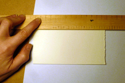
So rule up however you like. Hope you found a nice simple solution.
As for mine, you can't see the lines in the above picture, but you can work it out from the ruler width. I reckon I can get a bare two writing lines out of the rectangular space that's left in the middle – let’s say a slightly wider line on top, a slightly smaller one underneath, and a spacer line in between (for ascenders and descenders).
However many lines you've got, make sure your pen is roughly a width that will produce legible words inside them.
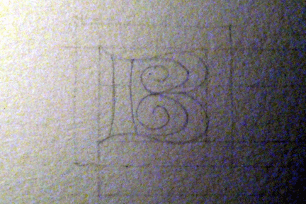
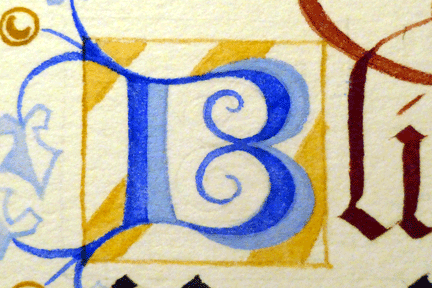
While we're ruling up, what do you think to an illuminated initial on this home-made card? It would be fun, they're easy, and it will give some impact to the text. I fancy a versal ‘B’ because of the nice curly bits in the middle.
So now I’m going to lay out a square for that to sit in.
Whatever letter you're starting with, pencil the square in lightly, flush with the top writing line, leaving some space around it for decoration later. Versals and Roman majuscules are good choices for initials.
Ugh, that photographed really badly. Adjusting settings ... adjusting settings ...
(A note on this make-your-own-card exercise, and on design and calligraphy in general. I find it’s much easier to make something decorative which involves fiddling around and adding details than it is to execute a really good, simple, rigorous design straight off. Doodling around in a Gothic style will allow for lots of decoration and addition of new layers, and so it's actually lazier than, for example, working to get three lines of spare, elegant, undecorated, jet-black italic just right.)
Make your own card, make your own ink
Now we need ink. Home-made greetings card => home-made ink. Or at least home-mixed. With the particular blue, red and yellow I’ve got I can mix a reasonable dark brown/black, testing on the scrap as I go.
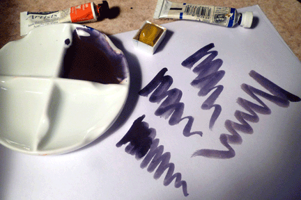
Too brown means add more blue; too purple, add more ochre; and then it's nearly black. If you're following along here, your colour will vary according to what kind of blue, red and yellow you’re working with. But, diluted to the consistency of thin cream, any dark brown or grey watercolour paint will function as ink.
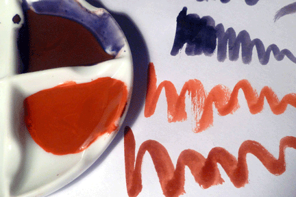
And as there are only two lines to work with on this card, I think I’ll do the top line in a nice broken red, to add contrast and emphasis on the first words of whatever it is I'm going to write. (If you'd rather stick to just black text, skip the next two photos.)
The vermilion straight out of the tube is almost eye-wateringly bright. To take the edge off, I mess it up with a dab of ochre yellow and some of the ‘black’ ink I’ve already mixed:
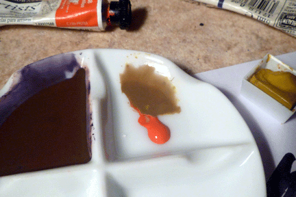
Mix it up ... still too bright ... add more 'black' ...
There. The bottom scribble below shows the final colour I've decided on. Not too brown, but not too glaringly vivid, either.
Prepping the pen
Now, on to prepare for the writing. (Perhaps my text should be 'Make your own card', to be meta. Except I've started with a 'B' now and 'Bake your own card' takes silliness too far.)
I have no idea whether these ancient quills will still work …
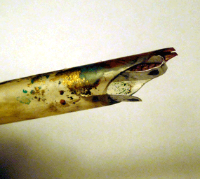
As it turns out my broad-cut quill does need trimming, and even after trimming is warped and not easy to use. Observe the horrible gap at the slit, and the remains of the inks of yesteryear. Please note (a) your nibs shouldn’t look this messy and (b) you do not need to make your own pen in order to make your own card – use whatever calligraphy pen you have to hand that suits you :-)
However, if you are using a quill pen to make your own card, now is the time to check whether it's good to fit the writing space you’ve got, and trim to size if desired.
Into the trimmed quill, I poke a small piece of bent foil I searched out just now in a drawer (probably cut from a drinks can ages ago) to act as an ink reservoir so the flow is steadier. You can see the foil loop lying against the nib-slit. You could turn it round so the unfolded end is sitting on the slit, too.
SIDE-NOTE for dip-nib users
It’s usually easier to fill a quill or dip-nib using an old brush, rather than dipping into a pot. This is especially true when using small quantities of ink, as with colour mixed from a tube.
How to do it: wet the brush thoroughly with the ink, so it's well loaded with colour. Then gently brush it over the side of the nib till you have a decent-sized drop of colour sitting between reservoir and slit. Park the loading brush somewhere close to hand, but not with the wet end poking out towards you (or you will end up with painted elbows) or lying on your desk (or you'll find the ink migrates onto fingers, other tools, etc and quite likely onto the finished piece).
Always test the nib and ink flow on scrap before you go back to writing on your final piece.
Did I mention to always test the nib on scrap paper, before you start writing and in between refills? This is the one great piece of time-and-labour-saving advice.
This broad nib I’m using is sulky. One side of it has distinctly bent away from the other (badly cured, age, poor original cut, uneven slit, whatever), so getting the ink flow to start is challenging. Priming the tip by dipping into some ink helps, and then putting slightly more pressure on the right than on the left. It's not ideal, and the test strokes are messy, but hey.
As I keep saying, the aim of this ‘make your own card’ session is to have fun with what’s available right now, not to try to perfect everything.
Writing out the text
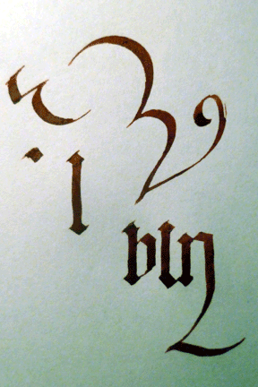
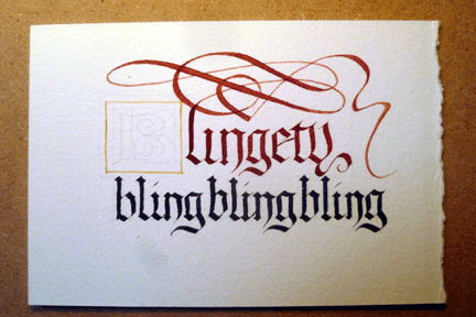
I've decided. I'm going to write ‘Blingety blingblingbling’ on my hand-made greetings card. Because why not? ‘Blingety’ starts with ‘B’.
(You can sketch the letters in with a hard pencil to check they’ll fit, as I have below. It's a bit of a cheat, and you have to watch out because the pencil lines aren't the same thickness as the pen lines. It's better and more professional to use the pen to do a test run of the whole text on the scrap paper, so you can predict how long each word will be. But we are feeling lazy, remember?)
So 'lingety' goes straight on, in red, with a curl on the 'y' to fill the line ... which looks like an unintended comma from a distance. Oh well. Then, for my next line, it's necessary to clean the red off both the quill and reservoir, and transfer a few drops of the mixed-black ink to the pen with the brush to write 'blingblingbling'. Which I start too large, and have to cram in towards the end. Meh.
So how are you doing over there? Here, after both batches of writing are done, is my home-made card in progress.
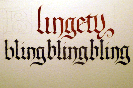
Let it be noted, this is not good Gothic. What's wrong with it?
- incorrect proportions
- uneven spacing
- too much sway on many of the downstrokes
- uncertain verticals which don’t line up well
- ragged edges to the strokes
Why? First, because I haven’t practised for a while and nor have I warmed up. Second, I didn’t do a test run of the design on scrap paper to get the spacing sorted out. Third, the nib size isn’t quite right for this line height – my own fault. Fourth (not making excuses, but) this quill is genuinely difficult to write with. Fifth, I failed to note that the watercolour paper is textured, which means the nib end doesn’t meet the paper exactly – that in combination with the sulky quill and the uncertain hand has resulted in the ragged edges.
Yeah.
Yours is probably going to be much better than mine.
Who cares? Mine’s legible – just about. And I'm having fun.
Onwards!
Flourishes ... and all that jazz
Remember the other quill? Have you got a fine pen there, too?
So far it hasn't been used. So I've decided to load it with red ink and draw some flourishes above the writing. (Even for this super-casual ‘make your own card’ exercise, I don’t fancy trying to draw flourishes with that other nib.)
The flourish is partly for fun, partly to balance the visual space, and partly to see whether I can distract the viewer’s eye from the poor quality of the Gothic lettering. The thin lines don’t look quite right (no pic, sorry), so I doubled some of them up in the places where a broader nib would have given a broad line.
And wow, does it look messy now …
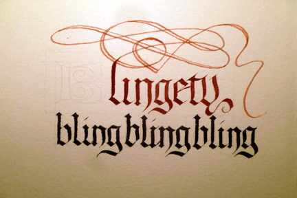
O.K.! Not the intended effect! But let's not throw it away …
… instead, how about filling the lines in with the paintbrush and pretending it was done with the broad nib after all?
Haha!
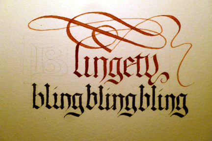
SIDE-NOTE on authenticity
Before my conscientious visitors write in and tell me that authentic medieval Gothic writing shouldn’t have flourishes like that: yes, you are right. I did it because I'm doodling a greetings card, not stickling for medieval authenticity. (If there are 'sticklers', surely 'to stickle' is a verb?)
If you want to make your own card look true to period, it’s best to work from a model, rather than making it up as you go along like I am doing here. Of course, if you want to make your own card in exactly the same manner that a medieval scribe actually would have made it, then I believe you should shamelessly copy about a third of it, do another third by memory of some fancy manuscript you saw somewhere, and otherwise, absolutely, make it up as you go along ;-)
Thinking about decoration, gilding, etc
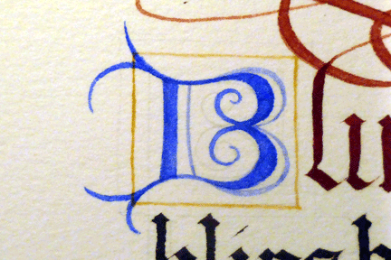
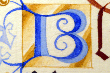
Around now, it would be useful to make some decisions about decoration of the initial letter. I think something simple, like gold. So I'll get some ochre onto the palette, for outlining. And I'd like to start filling in that initial 'B' with the colour it’s finally going to be, so we get an overall impression of weight. A mid-dark blue ... I’ll need a dab of the ultramarine and some white.
(Most medieval illuminated letters are not one plain colour, and often the way to make them stand out – and to make expensive coloured pigments go further – was to mix the basic colour with cheaper white to create subtly modelled 3-D effects or highly patterned textures.)
How do you want to decorate your initial letter?
So in the picture below I've now outlined the area to be gold – I've selected a square area that doesn't interrupt the flourishes, and maintains a little distance from the 'l' of 'Blingety', so that the gold doesn't swallow that first letter. Usually, of course, gold is put on before decoration like flourishes. Not today.
If you'd prefer some other form of decoration instead of gold round the initial letter, now's the time to decide what kind, how much room it should take up, and whether it's going to have a hard outline or needs to be pencilled in as lots of twiddly flowers and leaves, for example.
Now for the basic colour on the initial B. For the moment I’m just going to go with half dark blue to get a feel for how it will look. My blue painted curls don't follow the pencilled curls, because I changed my mind about what would look better. And on impulse I'm adding some protruding stalks for later leafy-and/or-floral-decor, thus:
How's yours? I'm sitting here genuinely feeling very curious about what your decorated calligraphic Gothic doodle home-made card might look like right now.
Fake 'gilding', and decoration cont.
Frankly, my dear, I simply cannot be bothered today with real-gold gilding on this make-your-own-card, so I’m mixing up some ‘gold’ colours here out of the ochre, red, black, and blue.
You thought we were going to do real gilding? Apologies. But painting fake gilding using ochre or raw sienna is a lot of fun too.
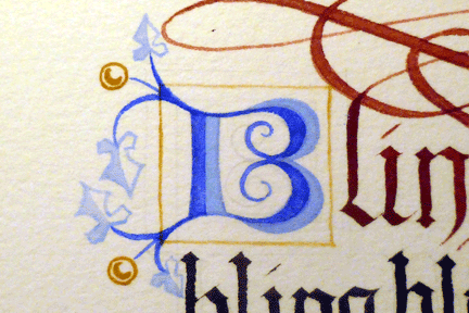
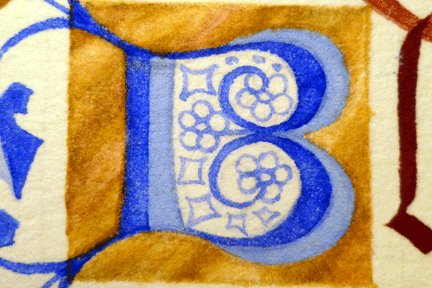
By the way, how do you feel about adding some gold balls to the initial B? Gold balls are good. And we might as well begin to get the pale blue onto the ‘B’; and I'm suddenly in the mood to add little fourteenth-century-looking ‘ivy’ leaflets as decoration, too:
So now for the fake gilding. If you're doing some other kind of decoration, skip the next three pictures. If you're hanging in there with me, just start by painting roughly diagonal stripes using plain, dilute, transparent ochre watercolour, like the picture on the right …
… and then fill in some darker colour in between; I've added small quantities of the previously mixed ‘black’ ink to the ochre to make browns, a little red to make orangey yellows, and even smaller quantities of blue to make a dull greenish colour.
Blend the dark to the mid-tones, and blend the mid-tones with water onto the plain paper to make a very pale, transparent ochre, almost white. Plain ochre gives a lovely glowing gold when it's dilute, but if you lay it on thickly, it turns khaki.
If you put too much paint on and it’s looking too muddy or heavy, you can take some back off again in selected patches by cleaning and wetting the same brush and gently stroking it over the surface of the paint to loosen the particles of pigment before pressing with a folded corner of kitchen towel or other absorbent paper.
And finally, you should end up with something that, if you squint a bit, looks like a painted 'gold' background for the initial 'B'.
I hope you are having as much fun as I am as you make your own card!
Meanwhile, while you weren't looking, I took the opportunity to paint some dark blue onto those little leaflets on my card, and started to fill in the floral design in the middle with details.
So I'm going to fill in the gold dots now, using some more crude trompe-l’oeil technique dragged out of a secondary-school art class on ‘how to shade a sphere’.
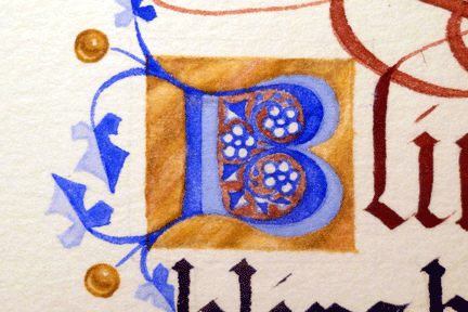
Once you've got the design in the middle of your initial sketched in, it's also a good time to think about filling in a coloured background. On my card, I've used the dark red left over from writing the first line – which both harmonises with the ‘-lingety’ and saves mixing up any more colours.
SIDE-NOTE: trompe-l’oeil
There’s a whole art of painting trompe-l’oeil (French for ‘deceive-the-eye’) to give an impression on the page of gold leaf and precious or semi-precious stones, realistic flowers, insects, small objects etc which is hugely enjoyable. Try searching for ‘gold sheet’ in Google Images and study the colours and effects. Most of what we think of as ‘gold’ is a quality of reflectivity, while the actual colours involved can range from brown and yellow to orange and green. It’s how those colours are linked, shaded and textured from darker to lighter that makes people think ‘gold’.
As a quick dirty fix to make your own card look as though it has a ‘gilded’ initial: paint slightly uneven lines of fake reflection on a rough diagonal (basically, imitating a cheesy Photoshop effect). The diagonal doesn’t have to be 45 degrees, but just some angle so the eye registers it as a quality of ‘naturally uneven light in the environment’ rather than something that’s suspiciously exactly lined up with the verticals and horizontals of the page.
Finishing touches to make your card fancier
Now to add lots of twiddly-fiddly, possibly unnecessary, but highly enjoyable detail!
Since I don't know what you're doing exactly with the initial letter on your home-made card, it's hard to offer help or guidance at this point. I used dark on light and light on dark to make the 'B' more elaborate, and white dotting down the middle to give the whole letter some sparkle, and added some outlining, and here's what I ended up with:
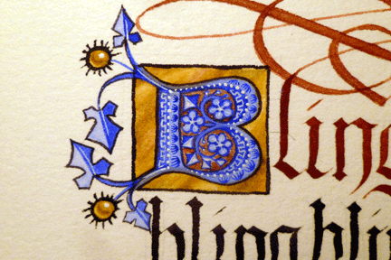
Your ‘gilding’ will need outlining, too, if you've used it. If you want that slightly crude, cheap-Book-of-Hours feel, all gold should be outlined in fairly heavy black.
The little leafy flowery bits inside the letter have been filled with light blue, and crisped up with thin painted outlines, and are fine.
In a fourteenth-century idiom, the leaflets have a single white line down their dark side for an impression of central veining, and the ‘gold’ blobs have a white dab of highlight and radiating lines in black around them. (I used my thin quill to draw these fat black lines, and the brush to do the finer lining round the leaves and the ‘B’ where it touches the ‘gold’.)
Final verdict: my ‘B’ has lost some of its nice contrast between light and dark. It could have been left as it was, but in my heart I just wanted lots of ornament. And I quite like the density and decor now.
How's yours? :-)
Make your own card: result!
So there you have it: something less than two hours’ lazy, pleasurable activity, from assembly of materials to erasure of pencil lines, including breaks for tea, phone calls, and taking the photos for this page. Here's the whole card:
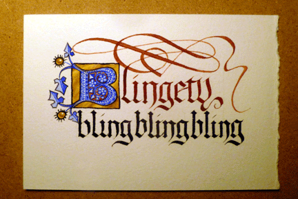
It's not a calligraphic masterpiece. However, it was fast and easy to produce, I had fun, and didn't worry once about whether I was getting things 'right' or not.
Just think, I could have watched a film in that time (or approximately sixty cat videos) but this way I have exerted myself painlessly and ended up with a nice little something to gift, sell, or keep. And the next one will be even better!
Hope you've enjoyed yourself, too.
To make your own card even more pleasant to produce, use your ears as you work. Audio-books and podcasts are excellent accompaniments to doodling, and if they’re useful or interesting then you get two things done at once. Or if you work from home, you could shed some illumination on a boring conference call :-)
Happy home-made greetings-card doodling!
Go to the 'Gothic alphabet' page
Go to the 'Fancy Lettering' page
Go to the Calligraphy Skills homepage