Calligraphy alphabets
Samples of various calligraphy alphabets are shown below to help your calligraphy. These are all written by me as an interested amateur.
Note other pages on the site have much more on gothic, italic, and rustic capitals. And a new page on copperplate-type scripts (including unorthodox use of quills!)
You'll also find links below to my free tutorial pages and useful books.
(Note: many more calligraphic and historical alphabets exist than just the ones listed below. But these will give you an idea of the major families of calligraphy alphabets.)
Have fun with the
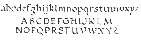
Roman rustic capitals
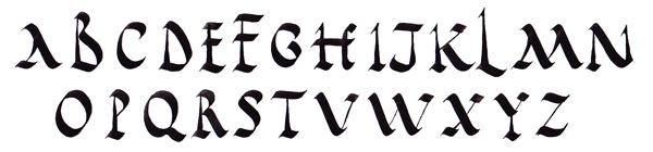
Rustic Capitals are a robust, dynamic calligraphy alphabet, good for titles when you want formality and impact without rigidity.
Rustic Capitals are the oldest script I include tutorials for on this site. They are basically a nib- or brush-written alternative version of the grand, stone-chiselled, square capitals you can still see all over Roman monuments.
Living in ancient Rome, you would have seen announcements, information or even rude messages written in Rustic Capitals on the walls of the city, in just the same way as advertising posters or graffiti today.
I love this alphabet, and so have written a free Roman Rustic Capitals tutorial to encourage others to use it more, too.
Two calligraphy books stand out for this script:
- The Historical Sourcebook for Scribes, by Michelle Brown and Patricia Lovett, provides analysis of the script and a calligrapher's expert breakdown of the pen-strokes involved.
- Marc Drogin's Medieval Calligraphy also offers useful diagrams – and Drogin uses Rustic Caps throughout his excellent book for section titles. His is the version I've based my own tutorial on.
Uncial
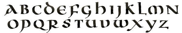
Uncial's rounded form owes something to the Greek alphabet, and historically it's associated with the early Christian Church. It superficially resembles traditional Irish scripts (Irish/Insular Majuscule). In one form or another, it was used in handwritten books for nearly a millennium. For much of that time it was strictly a calligraphy alphabet (rather than a historical script) in that it was written out slowly and painstakingly to look as impressive as possible.
Uncial is easy to read, with serene overtones, and lends itself to short poems, quotations, and titles. But it takes up quite a lot of space. Recommended tutorial books:
- For learning Uncial without historical reference, I recommend Anne Trudgill's Traditional Penmanship, which offers a straightforward, no-frills approach to producing a display version of the script.
- The Historical Sourcebook for Scribes, by Michelle Brown and Patricia Lovett contains two Uncial alphabets: the earlier, angled-nib version and what they call the flat-pen version.
- Marc Drogin's Medieval Calligraphy also includes two varieties of Uncial – a plainer version and the later, calligraphic, Artifical Uncial pictured above.
Gothic, textura quadrata
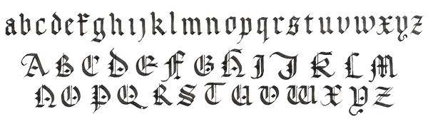
I have a particular soft spot for Gothic calligraphy alphabets. The above is a version of Gothic textura quadrata (which means 'woven-looking', because it's carefully done, and 'four-cornered', because the letters have a rectangular, blocky shape). This was the script of choice for centuries of book production in medieval Europe.
I offer several good, free pages on Gothic, including a nice intro, a three-page tutorial on the minuscule (small) letters starting here, and another tutorial page for writing Gothic majuscules (capitals).
Anne Trudgill gives clear instructions on how to produce a handsome Gothic alphabet, and, for beginners, I also recommend George Thomson's How to Master Broad Pen Script (his examples are huge and easy to copy, with helpful instructions).
For historical versions of Gothic scripts, as always, Marc Drogin's Medieval Calligraphy or Michelle Brown's and Patricia Lovett's Historical Source Book for Scribes will see you right.
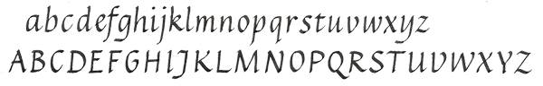
Roundhand (Foundation hand)
Roundhand is a modern, twentieth-century calligraphy alphabet based on the scripts of the Italian Renaissance, which themselves were invented because Italian scholars (in particular) had got heartily fed up of trying to read long texts written in tiny, cramped Gothic.
The great virtue of Roundhand is its simplicity. It may seem like a humble virtue but it is not therefore to be disregarded. Any Roundhand lends itself to circumstances in which you want to communicate sincerely and without pretension: poems by Robert Frost, instructions in case of zombie attack, children's alphabet posters, letters of advice to your younger self, diaries for publication, etc.
I recommend George Thomson's How to Master Broad Pen Script: it's as simple and unpretentious as Roundhand itself, and the examples are beautifully clear. Trudgill is also very good.
For a historical version of the script, see (again, always; it's a wonderful book) Michelle Brown and Patricia Lovett's The Historical Sourcebook for Scribes, pp. 111-120.
Italic, slanted
Italic is a beautifully legible calligraphy alphabet, elegant without being fussy, and has been taught for generations as the foundation of good cursive handwriting. It's not as simple as it looks to dash it off at speed! However, learning this script is well worth the effort. I offer a couple of pages to help – one on specific Italic letterforms, and one of more general Italic tips on issues like spacing, and I also recommend:
- Lloyd J. Reynolds, Italic Calligraphy and Handwriting. It's bossy, short, inexpensive, ancient (1969), and it works.
- The Historical Sourcebook for Scribes, by Michelle Brown and Patricia Lovett, which is very good for historical Italic (or Cancellaresca as it's more accurately known).
- The excellent, thorough treatment of Italic forms and how to write them in Eleanor Winters' Italic and Copperplate Calligraphy: The Basics and Beyond.
Copperplate style
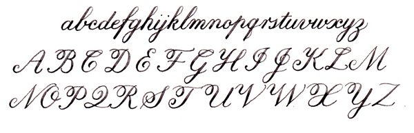
Copperplate is usually written with a finely pointed, very flexible steel nib which opens and closes with pressure to produce thick and thin lines. It's called 'copperplate' because today's calligraphers tend to write it in imitation of the very fine, heavily slanted scripts of eighteenth- and nineteenth-century engravings on copper plates. The engraved letters themselves were cut after beautifully hand-written examples, none of which survived the reproduction process required to publish them.
There are other names for similar scripts in the same family: English Roundhand (originally written with a broad nib), Engrosser's Hand (used for legal documents, certificates, etc), Spencerian (a graceful, American script with different use of thicks and thins), etc.
Copperplate-type calligraphy alphabets have an old-fashioned flavour but not too distant in time: think Interview with the Vampire, Dickensian clerks scratching away, or, in the US, the copy of the Declaration of Independence held in the National Archives.
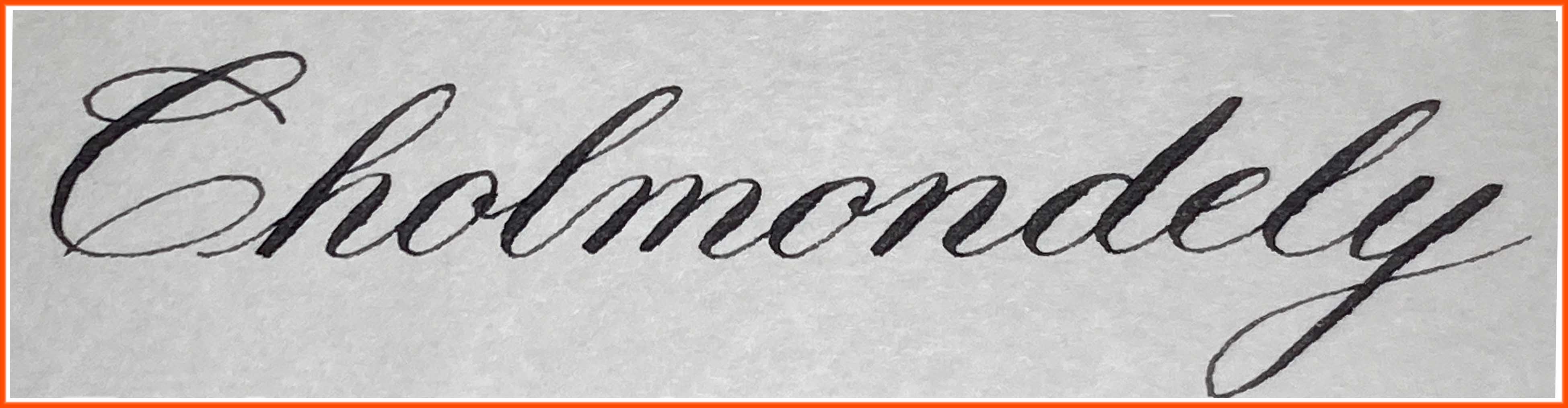
The example alphabet above is more rounded and curly than a true Copperplate, with less thin-and-thick contrast than you'd ideally find. The lower example ('Cholmondely') is a bit more respectable, written with a quill after I'd worked out the necessary grip and tip.
Any amount of practice on these graceful, flourished scripts is well repaid and they are suitable for a huge range of uses, from display pieces to wedding invitations to letters.
For me, the doyenne of Copperplate tutorial is Eleanor Winters, and I refer continually to her step-by-step manual Mastering Copperplate Calligraphy. There is more on Copperplate in her follow-up on cursive calligraphic alphabets, Italic and Copperplate Calligraphy.
Bubble letters, various homemade :-)
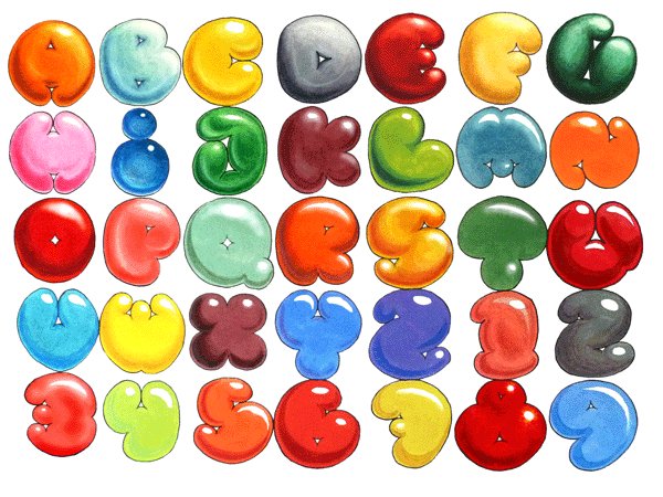
Just for fun :-) Arguably, bubble letters aren't a calligraphy alphabet. But calligraphy skills include the ability to draw letterforms such as Roman Monumental Capitals, and Versals, which are often coloured in or made to look three-dimensional, so I see no reason why bubble letters shouldn't also be on the menu. They're great for humorous or cheerful titles which appeal to the eye and are not intended to be taken too seriously.
As you can see, there's a variety of shading and lighting effects going on above – I was experimenting. Most of the effects use pen, brushes and artist's gouache but here and there I've done a bit of photoshopping, too.
This alphabet's my own design. I wanted to make bubble letters actually based on a circle, rather than drawn as outlines round a standard Roman capital letter. The process for each letter is described in three pages, starting here, or you might like this overview of bubble-letter forms.
That's it for the moment. Have fun with your own alphabets!
Return from 'calligraphy alphabets' to homepage
Calligraphy book reviews (includes all the books mentioned above)