Gothic Letters Step by Step – Part 2
Go back to Part 1
Go on to Part 3
Welcome to Part 2 of this online Gothic letters tutorial!
Note: remember, the letters here aren't presented in alphabetical order. By moving from the simpler to the more complicated, you learn them as easily and efficiently as possible.
We’re going to carry on with ‘m’ and ‘w’ before getting on to some of the more complex Gothic forms. Hope you’re feeling happy with your progress so far.
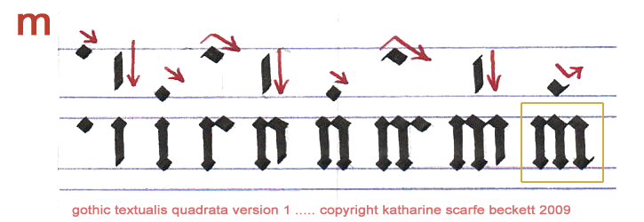
Nine pen-strokes! I know! Nevertheless, it looks great when it’s done with care. But straightaway, before you’ve even got your breath back, here's 'w':
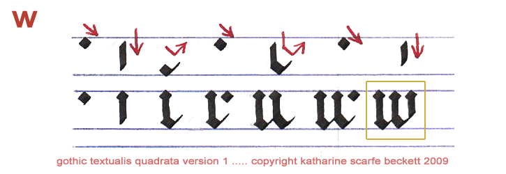
As you can see, 'w' is very similar to 'm' but the joins are at the bottom and perhaps it’s a little less hard work.
Amazing words are now pennable by you in authentic Gothic calligraphy. For instance:
me we mum win new mewl well clime mince wince eminence minimum
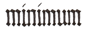
If you get ‘minimum’ neatly formed and evenly spaced, it will look like a very attractive black picket-fence. And if you turn it upside down, it will look almost exactly the same. That’s textualis quadrata for you! One of the reasons Gothic alphabets gave way to roundhand is that sometimes they were hard on the eyesight.
Next, we’ll do ‘t’ and two forms of Gothic ‘r’. ‘R’ comes in two varieties because it’s a letter that ordinarily carries its bulk on the left and opens out to the right with a lot of white space. This means that when it follows a bulky, ‘rounded’ letter with a solid right-hand vertical, such as ‘o’, ‘b’, ‘d’, ‘p’ or ‘y’, the combination of both letters looks crowded in the middle and irritatingly empty on the right.
So, a different form of 'r' is used, more like the front half of a majuscule (capital) version. It fills the space better. For example, have a look at the white spaces in these words:

(Basically, the alternative form of ‘r’ looks more balanced after a ‘rounded’ letter. I say ‘rounded’ in quotation marks because there are no rounded letters as such in this variety of Gothic lettering; it would be more accurate to say, ‘letters that would usually be rounded’.)
So, at last, after all that, here is actually how to pen these forms of ‘r’. Oh, and ‘t’, too, of course! --

Note that the Gothic letter ‘t’ is not 7 nib-widths tall. It is shorter than ‘l’ but taller than ‘i’, ‘e’, ‘n’, etc. Start it about 5.5 nib-widths above the baseline, so that the first short, thin diagonal reaches down to just above the ruled line that marks the top of the x-height. Then, angle cleanly down into a vertical, leaving a blunt corner where you changed direction. Make sure your pen is still at 45 degrees. Then place your nib (45 degrees!) to the left of that new vertical, so that the nib’s right-hand corner is just barely touching the outward corner of the angle, and draw a short bar straight across. The two oblique line-ends formed naturally by the nib should have joined at the top left of the ‘t’ to create a smooth, diagonal edge.
(You might want to read that again and look at the example. It’s like the trick for ‘e’ and ‘c’, but you’ve swapped the order you draw the lines in and you’re working on the lower, left-hand corner of the vertical line, not the slightly higher right-hand corner.)
I know, I go on a lot … how about some practice of your Gothic letters so far?
tut rut tree writ curt mutt trice writer enteric trimmer recliner
(You may be wondering what to do if the bar of the t interferes with the lozenge at the top of the minim on the following letter. That’s about ligatures (letter-joins) and for Gothic letters it’s a whole new lesson in itself.)
So, ‘r’ you happy with your fine English ‘t’? Then let’s move on to the next two:
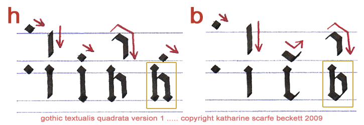
These Gothic letters need little explanation. The ‘h’ is basically an ‘l’ joined to the second half of an ‘n’. The ‘b’ is just a little more elaborate: it’s most of an ‘l’ combined with the bottom stroke of a ‘u’ and the top half of an ‘n’. That makes it sound more complicated than it really is. My point is that you already know how to form all the elements needed for these two Gothic letters.
So after a couple of trials you can get straight into the practice words:
hub bib the web batch cheer whittle hubbub brunch inhibit nibbler humbler churchmen
At this point, I’d recommend that you practise writing ‘the’ many times. As it’s one of the most common words in the English language – and as it contains one short letter, one tall letter and one in between – and as its balance (or lack of it) can make or break any piece of calligraphy you produce – it’s worth learning to write it well.
Here are some examples:

Notice how on the better-looking examples the verticals are all carefully spaced. The cross-bar on the ‘t’ barely touches the ‘h’. The ‘e’ should be placed carefully too – not so close to the ‘h’ as to crowd the word, and not so far away as to look orphaned.
The next two Gothic letters are formed with slightly more detail again:
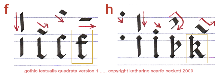
(Yes, I have noticed that I mis-labelled the 'k' as an 'h'. No I have not got round to changing it in four years ... Life so short, etc.)
The letter ‘f’ is a full-height letter but, like ‘c’ and ‘e’, you start about a nib-width below its full height so that you have space to add the stroke at the top and create a clean diagonal ‘edge’ at the top left of the letter. The cross-bar should be quite short and should sit fairly high.
On the Gothic letter ‘k’ the main interest is to place the bow high enough to leave room for a foot that doesn’t collide with the lozenge at the bottom of the first vertical, but also which doesn’t stretch too far out to the right. The distance between the first vertical and the foot of the ‘k’ where it touches the bottom line should be barely larger than the distance between the first vertical and the outside edge of the bow at its furthest point.
If that sounds too pernickety, simply ignore it and have a go at the following:
if kill funk brink skiffle bicker Fokker muffler wrinkle chicken bumfluff
When you are writing two ‘f’s together, it’s a good idea to shorten the top diagonal stroke a little on the first one, to make more room for the second.
The next two Gothic letters are about the skill of judging spaces. In fact, ‘o’ is only made of two strokes, but each stroke changes direction twice within 90 degrees and must be formed with the correct proportions so that both strokes fit together perfectly to make the final letter.
As you can see below, ‘q’ is formed very similarly, but the final stroke continues downwards below the line and terminates in a short serif. (You could also finish it with a lozenge, as on all the other letters, but I rather enjoy this one defiant flash of variety within the otherwise very uniform Gothic letters of this particular alphabet.)
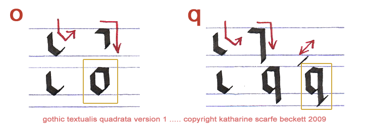
It’s well worth practising ‘o’ until you are very satisfied that you can draw both halves exactly and make them match up at the corners without much overlap. The Gothic letter ‘o’ is surprisingly delicate for such a square form, and its delicacy resides almost entirely in the precision and fineness of its diagonals as formed by the ‘point-to-point’ technique.
The ‘o’ also opens up a whole new caboodle of vocabulary (look how many ‘o’s are to be found in those few words alone!)
quo look toque quorum quench clique rococo emoticon roquefort unbroken coquette luminous
But you still can’t ‘mind your ps and qs’ as we haven’t done ‘p’ yet. So I guess that’s my ‘q’ to move on to the next Gothic letters in this sequence:
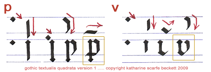
You can already see that ‘p’ is pretty much like a ‘b’ with a longer, flat crossbar. And ‘v’ is very like a ‘u’ – but make sure it has a very, very slight, graceful outwards bow if you want it to be clearly distinguishable from ‘u’.
viper pump verve prove pelvic hover whippet fervent peopled revolver peppermint
Well, that is pretty much the end of the ‘regular’ Gothic letters formed on the basis of the ‘l’ or the ‘c’. The remaining few letters are formed using moves that you will recognize from your work so far, in combination with some new squiggles and changes of angle.
You will find them all in the third and final part of this Gothic letters tutorial.
Go back to Part 1 of the gothic tutorial
Go on to Part 3 of the gothic tutorial
Go to 'Gothic writing: CAPITAL gothic letters A-Z'
Return from 'Gothic Letters Step by Step -- Part 2' to homepage.