Peter Burgess ... the reluctant scribe
Graphic designer based near Oxford, UK, specializing in typography and book design
In this guest post, Peter shares some of the thoughts, experience and surprising opportunities gained during a long career of using calligraphy professionally as a typographer and book designer. Enjoy!
I get asked to undertake all manner of strange projects.
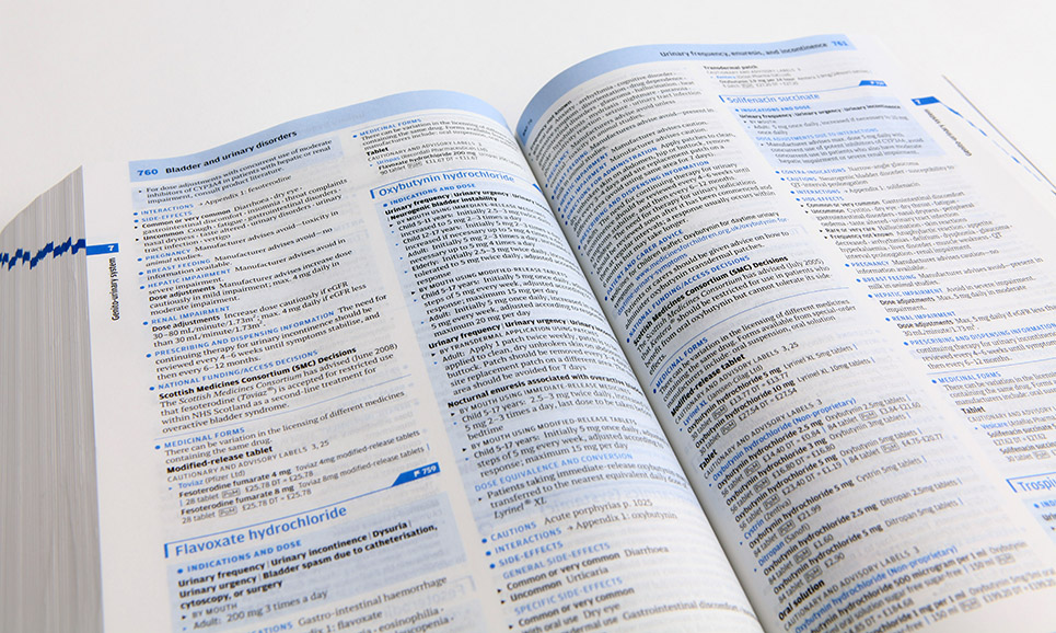
Much of my work is functional – Oxford Dictionaries, medical references, documents explaining the disposal of nuclear waste. This results in big, heavy volumes (perfect for propping up the computer monitor) in which attention to detail is vital. For example, if the style of numerals used in a medical textbook is not utterly clear, a patient might be accidentally overdosed with 1000 milligrams of a medicine when they need 100 milligrams. Sometimes I redesign individual letters to make them as clear as possible.
Thankfully, not all my work involves staring at tiny letters magnified 1000% on a computer screen! More creative work benefits from novelty, originality, and even experimentation. This can include new typefaces, hand-lettering … and sometimes a bit of sly calligraphy.
Saving lives with good typography
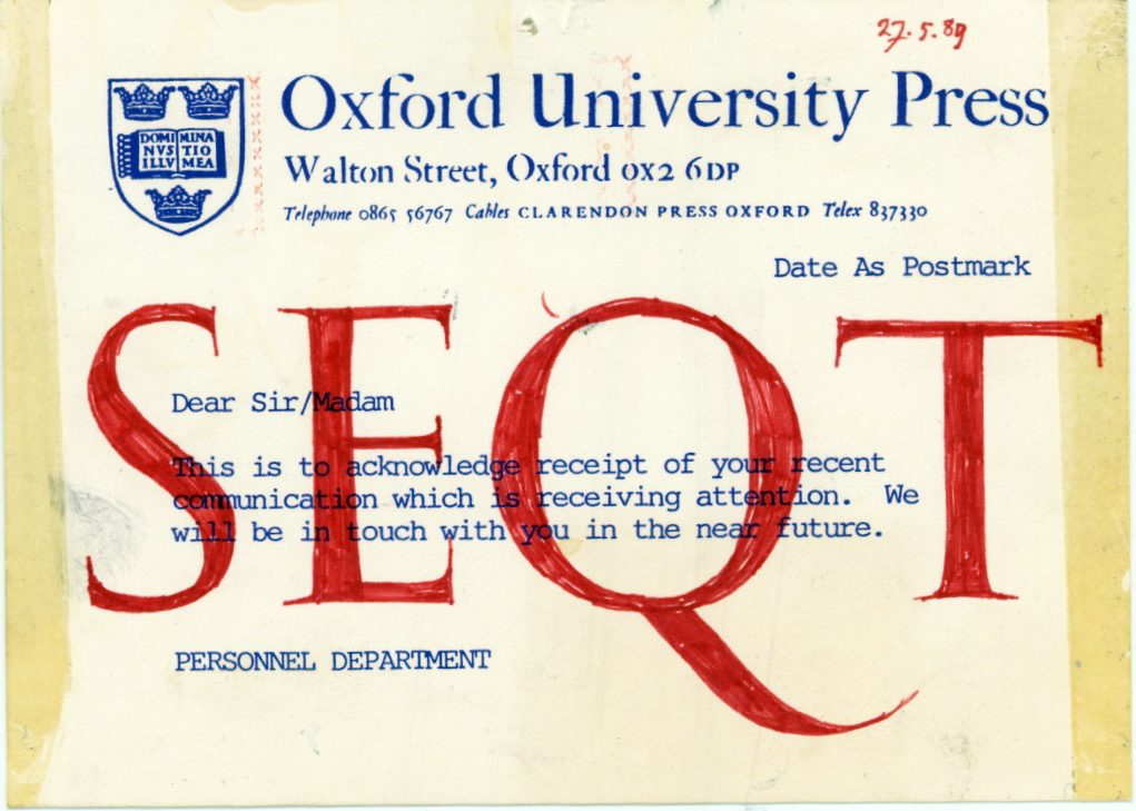
Doodling on office communications
How I got involved with calligraphy
My relationship with calligraphy began unpromisingly. At Art College, I dreamt of starting a band or, failing that, designing record sleeves. Calligraphy did not seem relevant at all – it looked so old-fashioned and boring!
My turning point was finding a copy of Jan Tschichold’s Treasury of Alphabets and Lettering (in translation). Tschichold was an alphabet maniac who did not mince words. He said you either had good taste or bad. I totally fell under his spell, became besotted with typography, and bought every book I could find about type. Thus, I also started to learn about the calligraphic roots of typography.
Soon, I needed to apply for jobs. In those days that meant sending paper letters. My handwriting was truly appalling, and it was a long trip to the nearest job centre to use their typewriter. Unless I could learn to write more neatly, I would be stuck in dead-end jobs forever. Many of the type designers I admired had very fine italic handwriting, so that was what I decided to try and learn.
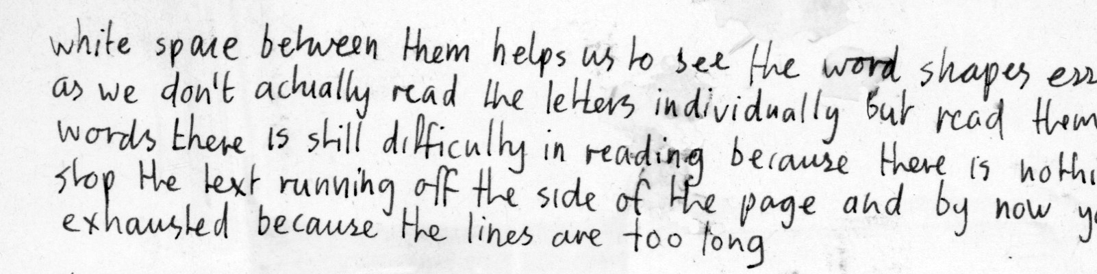
My best attempts at handwriting before I started to try and learn italics.
My first attempts were very spiky, but I kept practising like crazy and, after a few months, I got my first job.
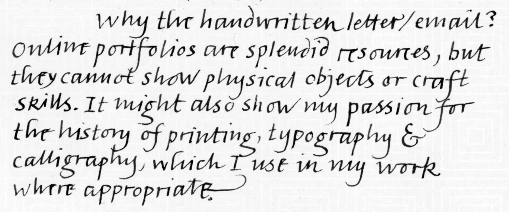
(above) My handwriting after persistent attempts to learn italics.
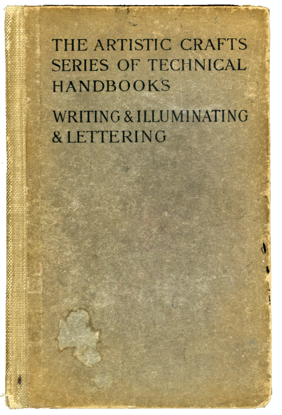
Then I bought my first copy of Writing and Illuminating, and Lettering by Edward Johnston. This book fired me up as much as Tschichold had.
Plenty of scribes have unbelievable pen prowess, but their work leaves me cold.
Johnston’s samples have a rawness and power – when you look at them, you think ‘I might be able to do that’.
(left) My battered copy
of Edward Johnston's
seminal Writing &
Illuminating, & Lettering
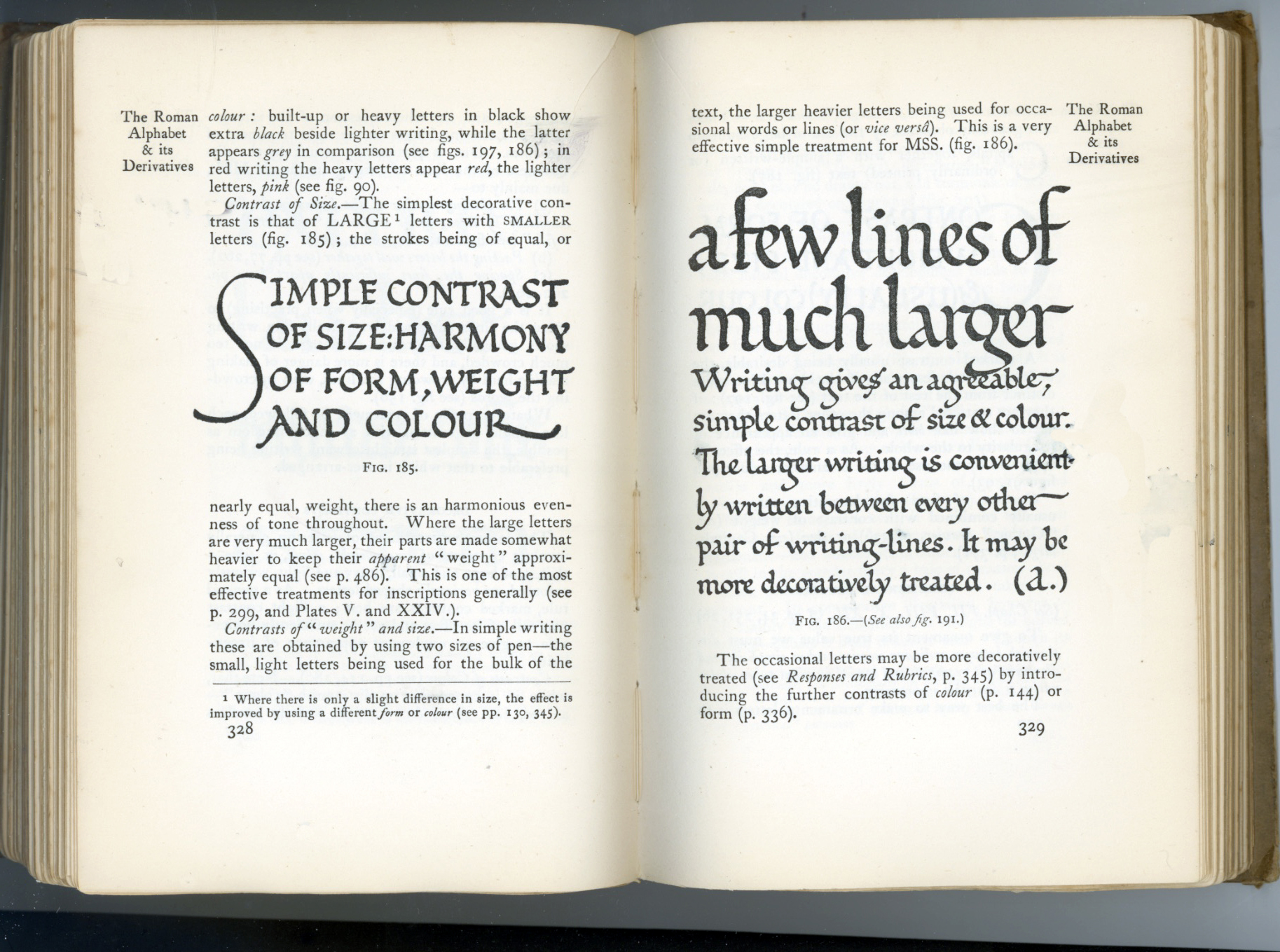
(below) This is still such an important book. Note that Johnston is unafraid to cross out a mistake (the 's' in 'gives' should have been 'give' to agree with 'a few lines ... '.)
I was inspired to join Oxford Scribes for evening classes but, frustratingly, my verticals kept kinking and I made slow progress. I was using proper scribe’s tools – steel-nibbed pens, which carry the risk of a scratch or a splatter – and I even did a workshop on making quills.
But during a workshop on Roman capitals with the late and brilliant Michael Harvey, we witnessed him casually draw a magnificent roman capital R with an ordinary highlighter felt-tip. I think everyone in the room gasped.
From then on, I used felt-tips, marker pens, or whatever felt right, and did not worry about whether letters needed retouching or not.
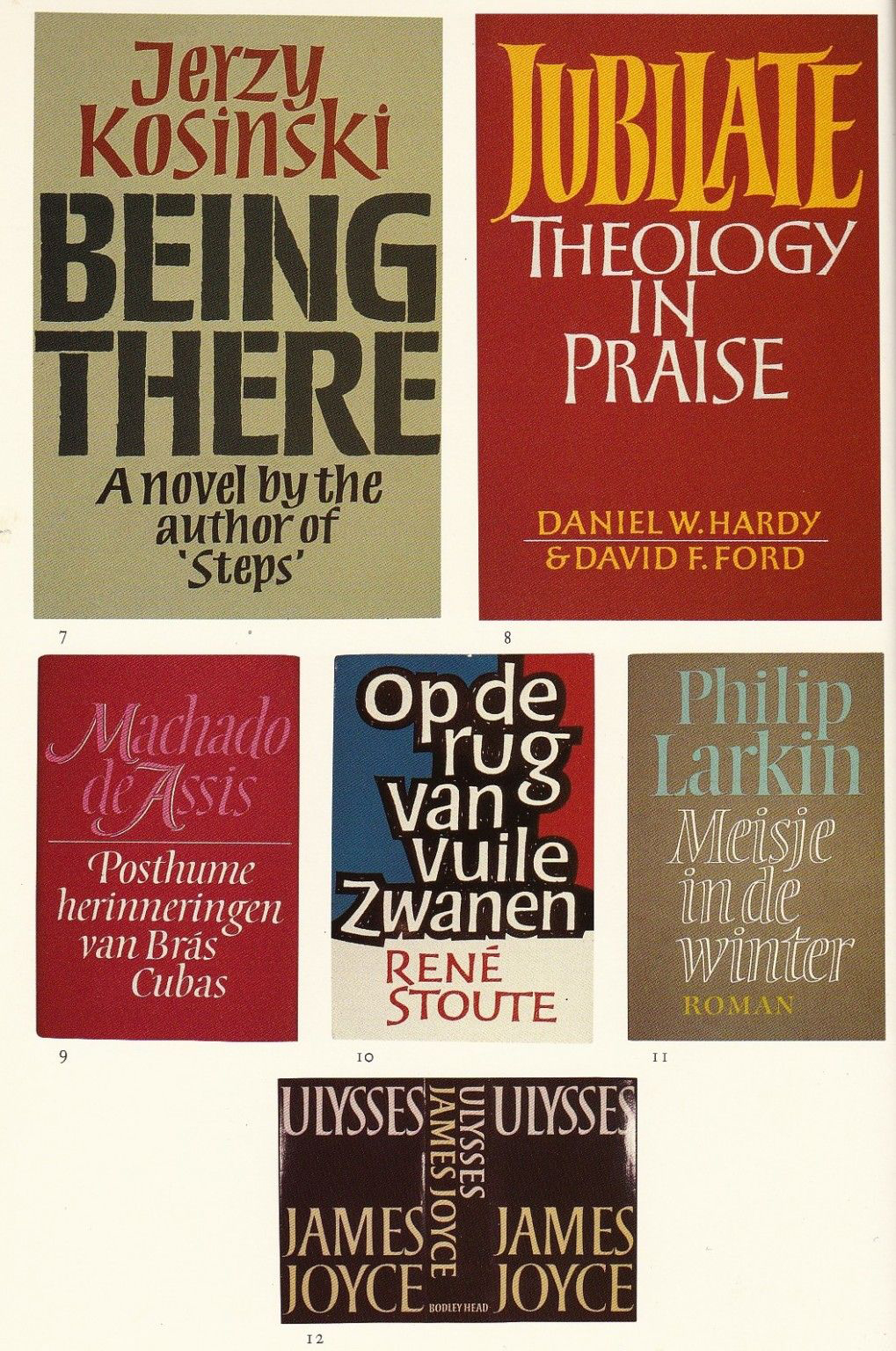
Book covers designed by Michael Harvey (ignore numbered labels)
Calligraphy, Lettering, and Typography
‘Calligraphy’ seems to have a different definition depending on who you ask. To my younger self, it meant something fussy and a bit kitsch – which was very judgemental of me!
Now, my own definition is far simpler: calligraphy is writing created with a quill, broad-nibbed pen, pointed steel pen, or brush.
‘Lettering’ is text produced by drawing an outline and filling it in, using calligraphic techniques and then retouching, or any other method that is neither typeset nor written straight out. A great example is the work of Berthold Wolpe, who designed amazing book-covers for Faber & Faber. I always used to think these were perfect examples of calligraphy (and in fact Wolpe was a master calligrapher), but when I saw some of the original artwork it was clear there had been lots of retouching to get the final result. That makes it lettering.
Original camera-ready copy for a book cover by Berthold Wolpe. The lettering has been reworked and retouched, but this would not have been visible on the final printed jacket. © Estate of Berthold Wolpe
‘Typography’ is easy to define. It is the creation and configuration of prefabricated writing. So, in type, each letter A in the same font (typeface) is identical however many times you use it. Older definitions of ‘typography’ link it to something physical – metal type and letterpress printing – but typography now is digital and viewed on a screen.
Of course, there are typefaces that are supposed to imitate calligraphy. Most of these are very ugly and not convincing at all.
The link between typeface design and calligraphy is endlessly debated. When Gutenberg printed his first Bible, he imitated the Gothic script of his time so he could pass off his books as being ‘as good as handwritten’. In Italy during the same period, the Renaissance literati disliked Gothic script, so Italian typeface designers imitated the rounder, more legible letterforms of Caroline minuscule which were in fashion at the time, and paired them with capital letters modelled on Roman carved majuscules. (This is how today’s familiar, roman alphabet evolved.)
All these early typefaces tried to look like handwriting. But as metal type continued to evolve, it moved further and further away from models created using a broad-edged pen. Metal type is made by cutting or punching around the letter shape on a small block of metal, which is a very different physical process from writing with a quill – more akin to carving.
Today, typefaces designed on computers are free of the restraints of both feather and metal, but typeface creation is still not very calligraphic. The fact is, readers do not want novelty or pretty patterns as they read. Ideally, they won’t even notice the typeface: it should be so easy to read that it disappears from their consciousness, leaving them free to concentrate on what the text means.
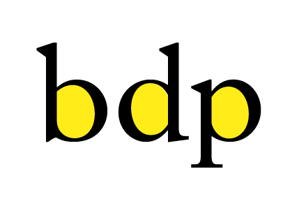
Achieving this gets quite technical. The different letters must be easily distinguished from each other, yet also consistent, with matching details throughout such as angles, curves, heights and white space. A type designer will use the same shape for the counters of lowercase d, p and q, keep the serif design standard in all the letters and so on. There is little room to be expressive.
All typefaces have families of letters that share similar characteristics.
The idea that typography is independent from calligraphy has been challenged, most recently by Gerrit Noordzij in The Stroke of the Pen. Noordzij shows an underlying pen-written structure for all letterforms and type, even metal type. I am not totally convinced, but I do believe that ghosts of written forms remain in the design of typefaces.
In any case, knowing about calligraphy gives a designer a commercial edge because understanding how letters are created helps you make informed choices.
What type cannot do
With hundreds of thousands of good typefaces available (and quite a
few thousand lousy ones too!), you might imagine there is a typeface
available to solve every design problem conceivable, but not so.
When
I designed a poster for Carl Orff’s Carmina Burana (music inspired by a
thirteenth-century manuscript) there were very few typefaces with a
medieval feel that were suitable to be set in large sizes. Instead, I
drew very large versal letters which were then retouched and
photographically reduced to make them sharper.
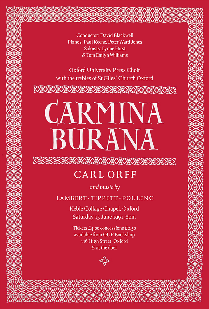
Carmina Burana poster designed by Peter Burgess. © Peter D Burgess
Calligraphy for Kate Bush
I had a very unusual commission last year. I’d written a letter (in my usual italics) to get back in touch with the publishing house Faber & Faber. A few months later, they phoned me: to my huge surprise, my letter had been shown to Kate Bush, she liked my writing, and I was commissioned to produce some visibly ‘handwritten’ lyrics for her new book How to be Invisible.
The trick was to replicate the original sample’s spontaneity in all twelve illustrations, knowing the author wanted to avoid the text looking too contrived. As Faber is very well known for commissioning cover designs by Berthold Wolpe and Michael Harvey (two of my all-time lettering heros) this was a very exciting project for me.
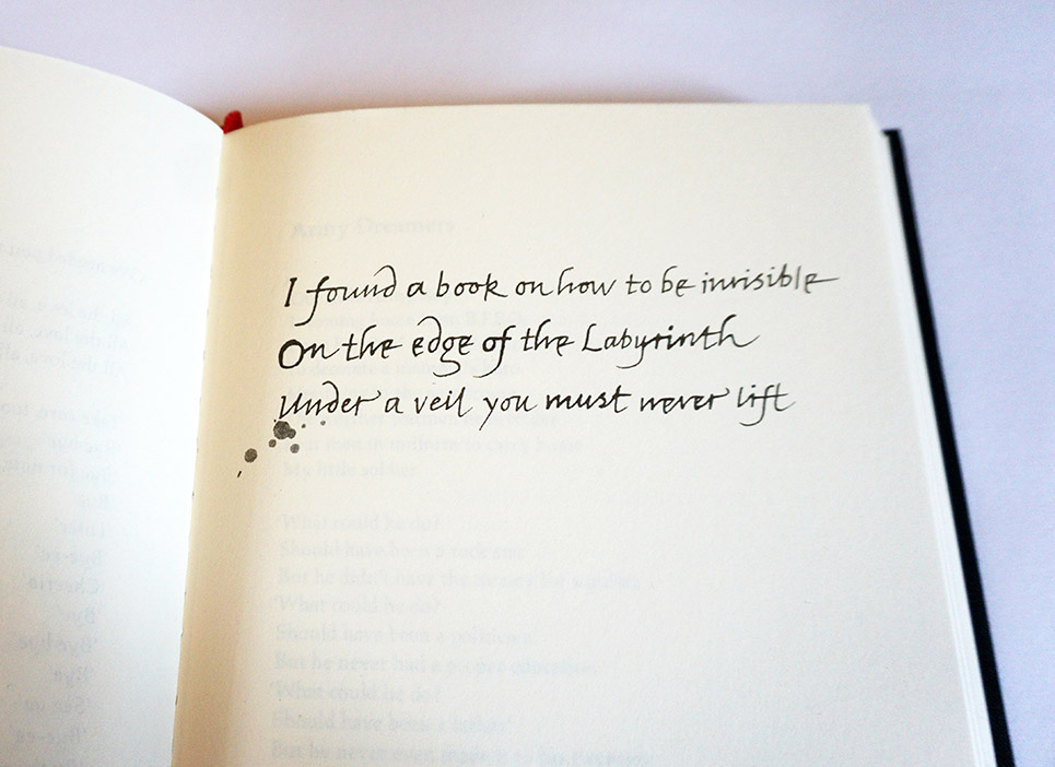
Page opener of How to be Invisible, with handwriting by Peter Burgess. © ???
Authority v creativity
I sometimes wonder if calligraphy books can be a bit of a strait-jacket due to the same sources being so omnipresent. Dozens of books show the lettering on Trajan’s column, but no other Roman carved letters. When I first went to Italy I was amazed at the number and variety of Roman carved capitals.
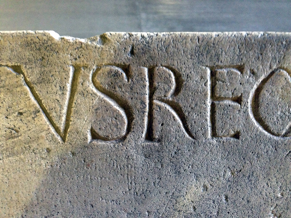
Carved lettering from the Castelvecchio Museum, Verona. Image © Peter D Burgess
I too am guilty of being yet another Edward Johnston copyist, which loses the point of what a book like Writing & Illuminating, and Lettering is all about. I think Johnston’s intention was to get students to find their own models and adapt them to their own needs – as he did with the Foundational hand.
So graphic designers need to look outside the confines of broad pen lettering. Sign writing and other styles of architectural lettering are also really interesting.When I lived in Cape Town, I noticed a very lively, local lettering style that I had not seen anywhere else.
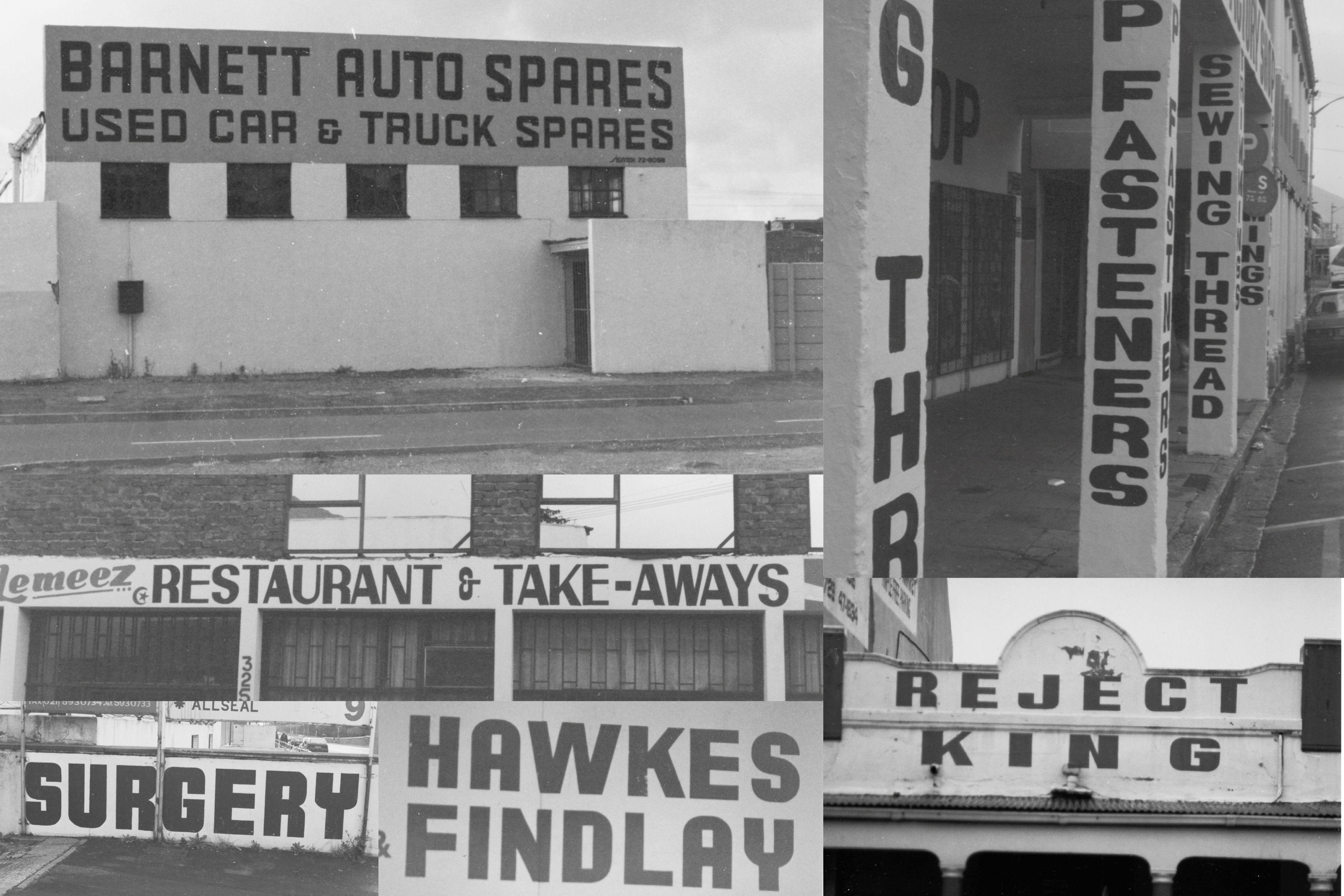
Interesting source material in Cape Town, 19XXs
Sadly, while I was there, many local businesses started to replace the older, hand-painted facades with newer plastic ones, so I decided to preserve the style by making a typeface based on it:
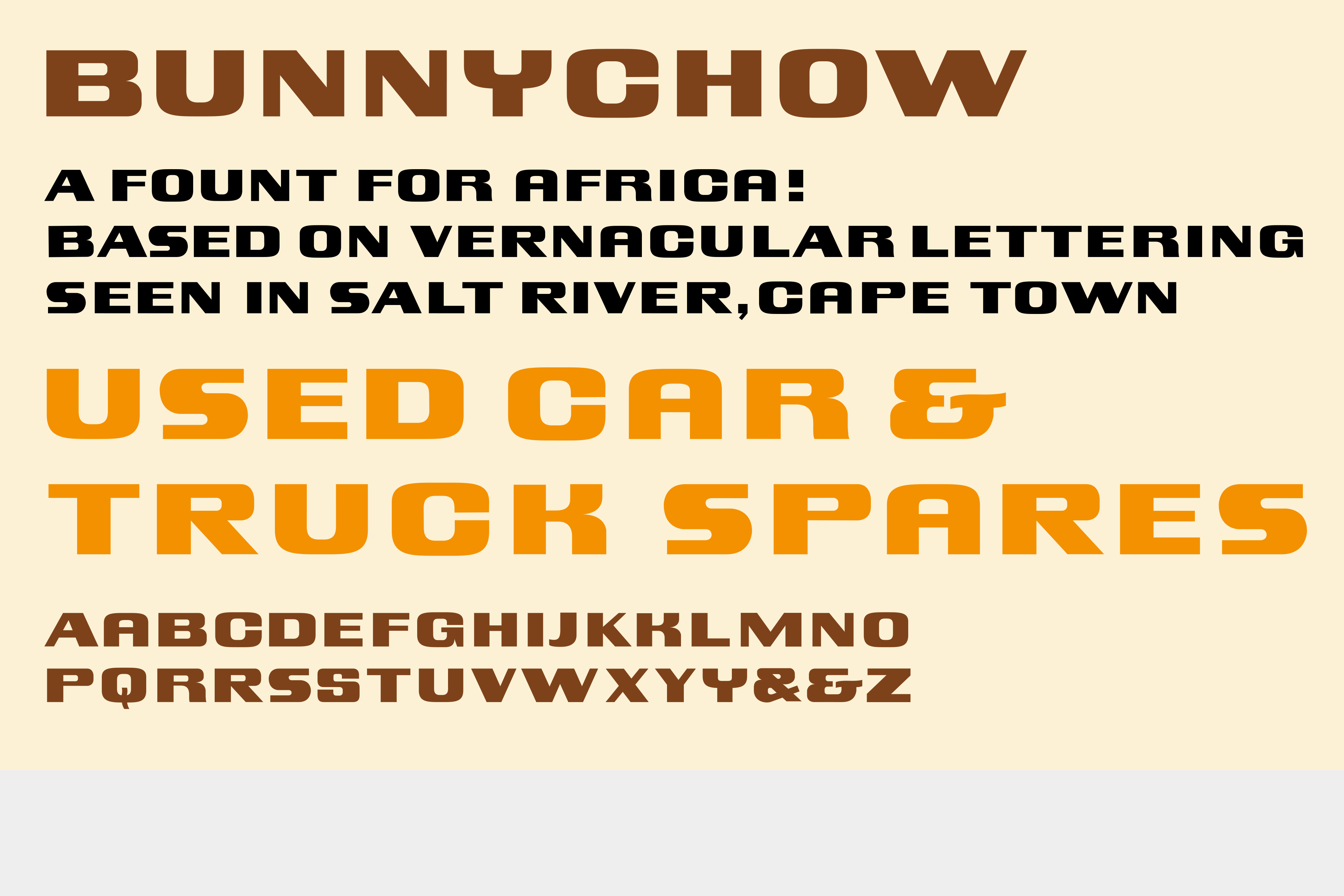
Sample of Bunnychow, © Peter D. Burgess. Not a lot of influence of the Trajan Column here!
Great lettering can be seen in many other places: fairgrounds, architecture, boats. I especially like hanging out in graveyards as tombstones have wonderful designs. The 19th century in particular is rich with interesting lettering styles.
In recent years, I’ve developed a fascination with graffiti. There is much less handmade architectural lettering in the UK than there was even twenty years ago, and one of my half-baked theories is that this loss of vernacular lettering might be the reason for the rise in graffiti, because we need something more alive than corporate plastic in our cities.
Part of the appeal of graffiti is superficially it breaks all the rules of ‘good’ lettering – it slopes backwards, or its letters overlap. Graffiti is definitely the punk-rock member of the hand lettering family.
Mountain bike company logo. © Peter D. Burgess
Tips for calligraphy-skills.com readers
(… or, ‘do as I say, not as I do’!)
- Look at good books.
- Visit museums to study handwritten books and manuscripts rather than reproductions. You will be amazed at the originality and diversity of different styles.
- If you find the foundational hand hard, try learning chancery italics first.
- Do persevere no matter what. Practise as much as you can. Your technique will improve. No one is born a natural scribe.
- Make everything you letter or write a small, self-contained artwork. Filling up endless ‘practice sheets’ will only enable you to produce … practice sheets. Make it your practice instead to produce well-written, properly laid-out texts.
- Above all: have fun.
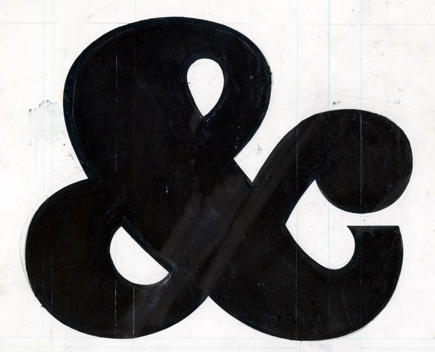
Design for ampersand in Wallop typeface, © Peter Burgess
Bibliography
Fairbank, Alfred, A Book of Scripts
Fairbank, Alfred, A Handwriting Manual
Gourdie, Tom, The Ladybird Book of Handwriting
Johnston, Edward, Writing and Illuminating, and Lettering
Hewitt, Grailey, Lettering for Students & Craftsmen
Tschichold, Jan, Treasury of Alphabets and Lettering