Philippa Dow, watercolour artist
Philippa Dow
Watercolour artist based in Essex, England
In this guest post, Philippa describes her lifelong love of colour and words and the compelling work of making them speak together in her art.
Beth Chatto, the great plant and garden expert, said 'right plant – right place' and I feel that this can be taken into all creative walks of life.
With the right tool and right paint I am a fulfilled artist/calligrapher. Put a Mitchell nib and plastic pen-holder in my hand and I am cross and weeping.
This realisation has taken me thirty, or more, years to realise and it had to be pointed out to me by the calligrapher Sue Hufton when she first saw some of my work and said, 'I like these. They may not be the right proportions but they just look right. But these letters done with a metal nib are not happy. They are heavy and awkward."
I first started painting with Windsor and Newton watercolours when I was ten years old. My mother gave me a box of paints and sent me off down the garden with them. I happily painted and bounced back to show my mother the result.
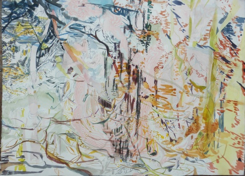
Philippa Dow, 'The Grove', watercolour, 77 x 56 cm © Philippa Dow
She said 'It just isn’t right. Watercolours have to have masses of water and then the white paper can work through the colours.'
Instead of my pouting and giving up painting, a spark was ignited. My mother had gone to art school, drew exquisitely and was kind as well as critical so I respected her comments.
She also read poetry to us as our bedtime stories. Real poetry, or adult poetry, read to children was sound and not meaning. Added to that, I had a fanatical love of classical music and song which meant that it was inevitable that calligraphy would creep into my work. Words mean a lot to me.
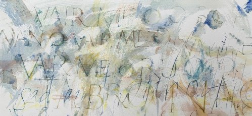
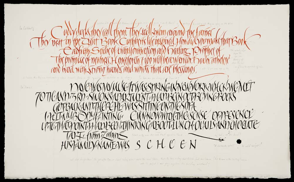
Phillippa Dow, 'Hebridean Folk Song', watercolour and goose-quill calligraphy, 38.5 x 18cm
© Philippa Dow
At sixteen, I was accepted onto the Foundation Course at Colchester School of Art. I had the immense good fortune to be taught drawing in the most rigorous way from Richard Bawden (son of Edward) and learnt calligraphy from Denzil Reeves.
It was something I couldn’t leave alone and practiced endlessly. Ink-stained hands, nibs scratching with a massive sense of failure and yet I persisted. Denzil taught me all the basics such as Roundhand, Italics, Roman, Uncials etc and he taught me to gild, to prepare vellum, to cut a quill with a cumbersome Stanley knife.
But I just produced fat, ugly letters which gave me no inner peace or job satisfaction. I found the texture of metal nibs scraping against paper set my teeth on edge!
Perfectly respectable calligraphy which, as I worked on it, did not inspire me in the same way watercolours do.
© Philippa Dow
The first spark came when I discovered a book about David Jones the
poet, artist and lettering artist. He had painted the letters which he
drew or shaped with a sense of form and perspective. Plus he was part
Welsh like myself and had taught himself Welsh just as I had done in
order to read Welsh poetry. It was a love affair which nudged me onto my
next journey.
This journey I kept secret. The paintings I
started to produce at this time I thought were wrong. They had very
little to do with proportion and I never measured anything. I just wrote
with a brush and filled in the letters.
At about this time I
moved onto Central School of Arts and Crafts which quickly became Art
and Design and then quickly changed to Central St Martin’s Art School. I
went there to study etching, metal engraving and wood engraving but my
secret lettering continued.
(Metal engraving is something which
taught me about drawing using textures and tones but there again was
metal scraping – teeth on edge.)
My wood engraving tutor, Ian
Mortimer, was a typographer renowned for his high level of printing
standards. He taught me typography for one day. One day only, because it
was a disaster for both of us! Although he was a truly kind and patient
man, my chaotic mind could not grasp the orderliness of typography. I
dropped things and bent things and was only saved by being thrown from
the room when I said 'It isn’t my fault; the lead is wambly.'
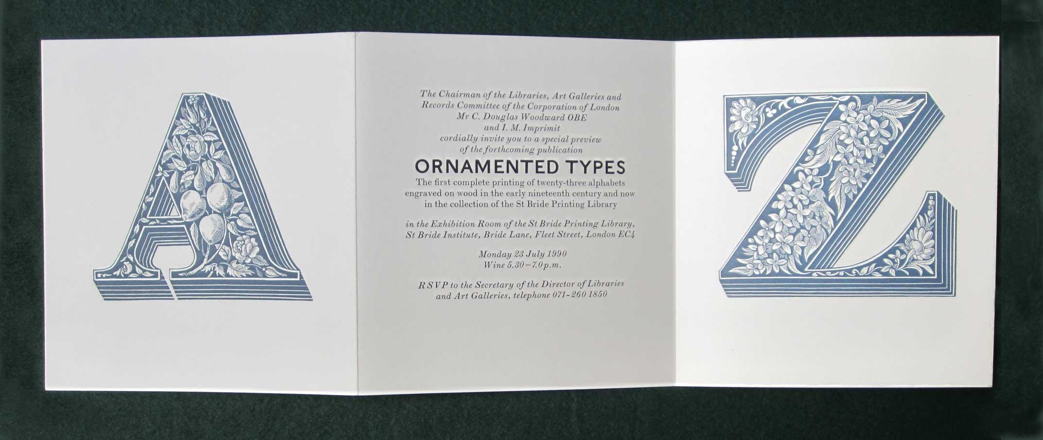
Print by Ian Mortimer (I.M. Imprimit) © Ian Mortimer
Ian stared at me. 'Wambly!? Wambly! What a wonderful word!' And he roared with laughter.
It
had the effect of thawing me out of my acute shyness and it made it
possible for me to show him all my work which I had kept hidden from
everyone.
Ian introduced me to Nick Biddulph, who had been the
photographer for Stanley Knight’s book Historical Scripts: A Handbook for Calligraphers. He
showed me books which helped me see the difference between 'good'
lettering and 'bad'. An essential thing to learn.
And they sent
me off to the manuscripts room at the British Museum and told me draw
letters from the manuscripts which I was attracted to. Also to do
lettering every day.
I also read and re-read Nicolette Grey’s book Lettering as Drawing. This book is the one book I would have for help with lettering. It is my creative muse.
Teaching
and commissions made my explorations into what I needed as an artist
much harder but the next stage in my self learning was meeting Ewan
Clayton about five years ago. He helped dispel my permanent feeling that
what I do is wrong, or even naughty! He allows movement, exploration
and experimentation.
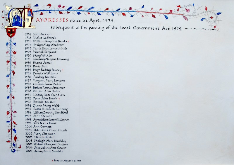
Ewan Clayton, 'A Book of Hours for the Vernal Equinox', the Crafts Study Centre © Ewan Clayton & CSC.
And the other tutor who has given me a passport into my true world is Sue Hufton. Her practical approach made me realise that it is impossible to work using tools or ink which do not follow my inner comfort. She taught me how to cut quills properly (an unbelievably careful and time-consuming skill which I’m still learning) and showed me how to paint letters with a Handover sable brush whilst trying many different types of paper until I found the one which suited my needs.
From Susan Hufton's 'Written Letters' © Susan Hufton
My needs are to combine paintings with letters. It is a complicated journey and it’s one I’ve only just started on even though I’ve been with it ever since I was a tiny child and copied letters from books and gazed at art.
I need to add that I now no longer adore David Jones’ Painted Inscriptions in the way I once did, as I find them heavy – but what has to be said about his work is that he was not a calligrapher and nor am I. We are artists making pictures to convey a mood of a poem and that is the difference.
And the answer to how to make things the correct way is 'right tool – right place'.
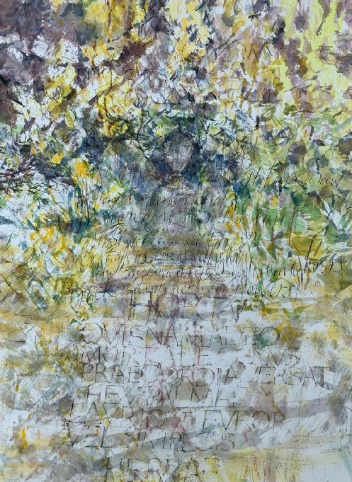
Phillippa Dow, 'Thoughts in a Garden', based on the poem by Marvell.
Watercolour and goose-quill calligraphy, 57 x 77cm
© Philippa Dow